Overview
A Trend Chart can be added to a Grouped Table. Trend Charts analyze trends and changes in Data over a period and define peaks and valleys in the Data.
User Account Requirements
The user account you use to log into Resolver must have Administrator permission to add a Trend Chart to a Table.
Related Information/Setup
To add styles to your Chart, please see the link below:
Please see the corresponding articles below for Information on Adding a Chart Type not covered by these instructions.
- Adding a Chart to a Dashboard
- Adding a Multi-Series Chart to a Dashboard
- Adding a Combo Chart to a Dashboard
- Adding a Table to a Dashboard
- Adding a Crosstab to a Dashboard
- Adding a Heatmap to a Dashboard
- Adding a Map to a Dashboard
- Adding a Box and Whiskers Chart to a Dashboard
Navigation
- From the Home screen, click the Administration icon.
![]()
Administration Icon
- From the Administrator Settings menu, click the Admin Overview link.

Administrator Settings Menu
- From the Admin Overview screen, click on the Dashboard Builder tile under the Views section.

Dashboard Builder Tile
- From the Dashboard Builder screen, click a Dashboard Name.
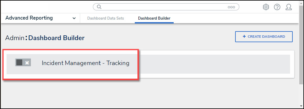
Dashboard Name
- From the Dashboard screen, to access the Chart screen, click on the Add Chart button.

Add Chart Button
- Or click the More Options icon on an existing Chart View.
![]()
More Options Icon
- Click the Edit option from the More Options dropdown menu.

Edit Option
- From the Chart screen, click the Trend Chart panel from the Configuration panel.

Trend Chart Panel
- Click the +Add Trend Chart link.
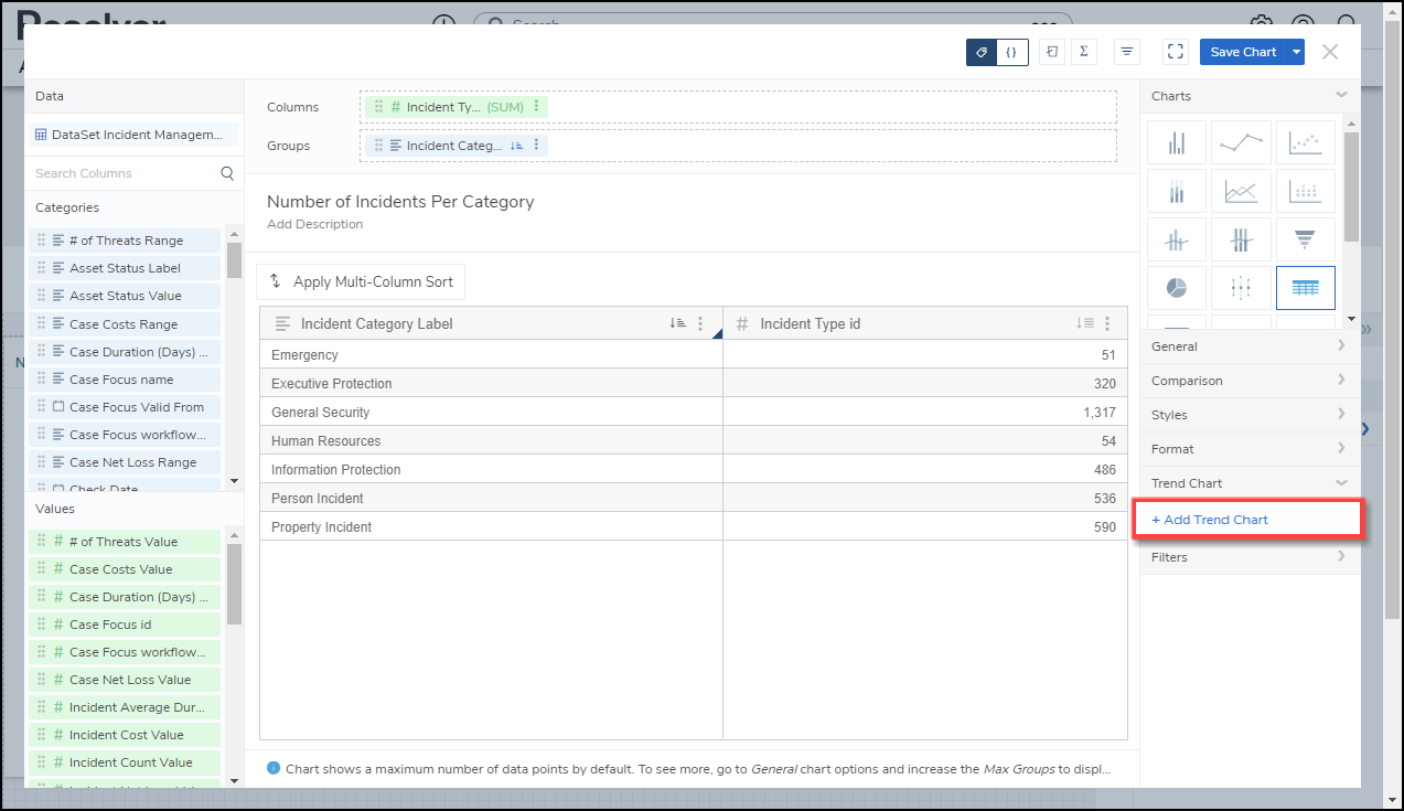
+ Add Trend Chart Link
Adding a Trend Chart
- Click the Trend Chart Num 1 link.
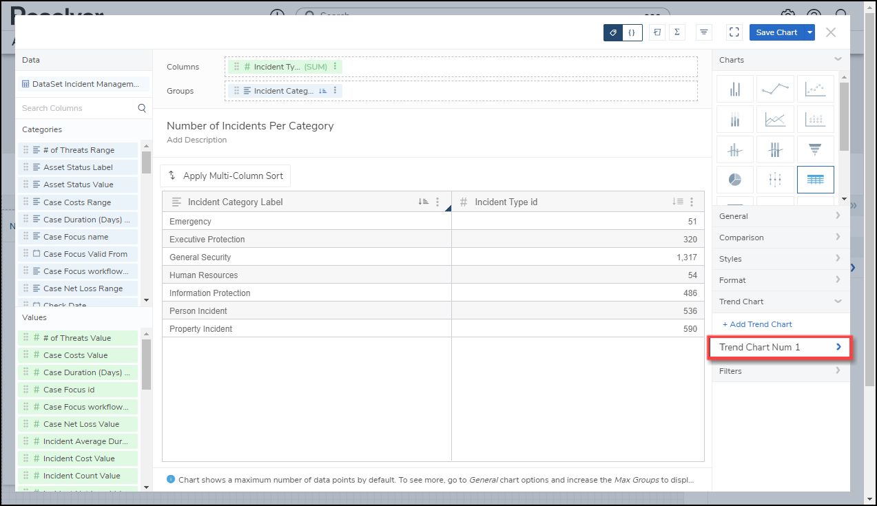
Trend Chart Num 1 Link
- Select a Trend Chart Type:
- Sparkline - Line: The Sparkline - Line type applies a line to the Chart displaying data trends.
Sparkline - Line Type
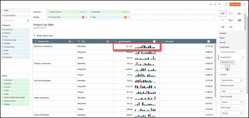
- Sparkline - Bar: The Sparkline - Bar type applies a Bar graph to the Chart displaying data trends.
Sparkline - Bar Type
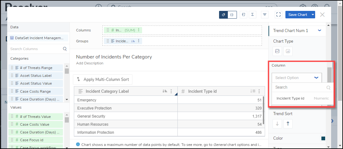
- Select the Column displayed using the Sparkline from the Column dropdown menu. Only data Categories in the Columns field will appear on the Columns dropdown menu.
Column Dropdown Menu
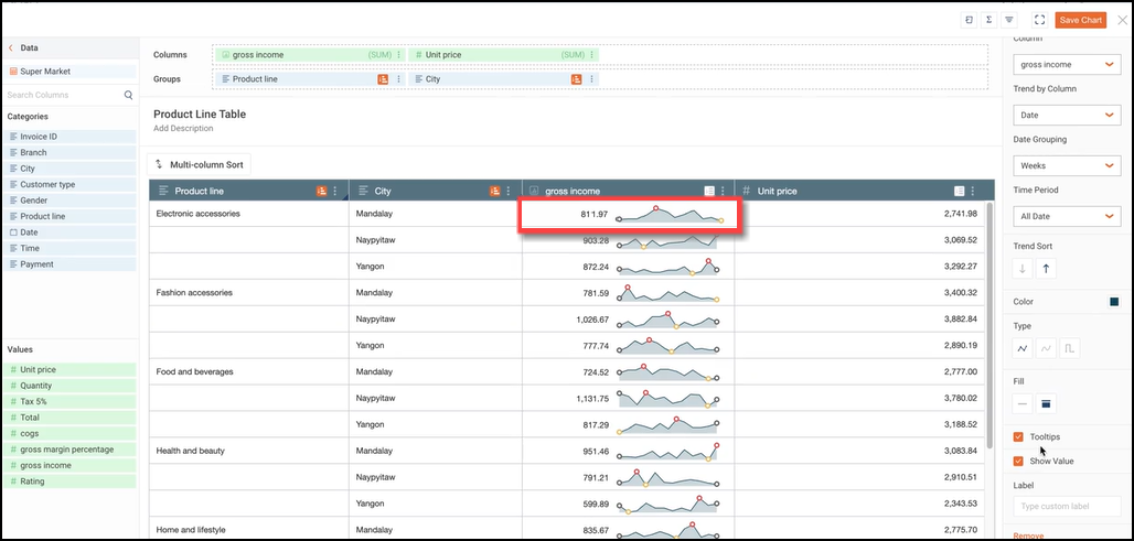
- Select a data Column from the Trend by Column dropdown menu. The Column selected will be used to plot the Data Value coordinates like the x-axis. Only Numeric and Date Columns can be selected from the dropdown menu.

Trend by Column Dropdown Menu
- Numeric or Date:
- Trend Sort: The Trend Sort option allows users to sort the trending data in an Ascending (e.g., 0 - 10) or Descending (e.g., 10 - 0) order.
- Color: The Color option allows users to select the Sparkline's color.
- Type: The Type option only appears for Sparkline - Line types and allows the user to select the type of line used to represent the Sparkline (e.g., Line, Spline, Step). The Type changes the way an increase or decrease in Data looks.
- Fill: The Fill option only appears for Sparkline - Line types and allows users to select whether fill is used to highlight the area below the Sparkline (e.g., None or Below).
- Tooltips: The Tooltips checkbox allows a user to select whether to apply a Tooltip pop-up to the Chart to include Data Point Values (e.g., values include Start, Minimum, Maximum, and End).

ToolTip
- Show Value: The Show Value option allows users to add the aggregated values before the Sparkline. If Show Value and Label are both selected and, the column is not wide enough to display values, only the Label value will be displayed.
- Label: The Label option allows users to add a custom label that appears before the Sparkline. The Label will also be used to rename the Trend Chart. The new name will appear on the Configuration Panel instead of the default Trend Chart Num 1.
- Remove: Click the Remove link to delete the Trend Chart.
- Numeric Only:
- Max Data Points: Click the Max Data Points field and enter the number of Data Points you what to display on the Chart, or use the increase and decrease arrows to adjust the Max Data Points value. The Max Data Points field controls the number of Data Points that appear on the Chart Canvas. By default, the Max Data Points field is set to 50.
- Date Only:
- Date Grouping: The Date Grouping dropdown menu allows users to group data by selecting a period (e.g., year, quarter, months, etc.).
- Time Period: The Time Period dropdown menu allows a user to select a period to pull the data from (e.g., this year, last year, this quarter, etc.).
- The Sparkline Data Points are color-coded to indicate the following:
- Gray = Starting Data Point
- Gray = Ending Data Point
- Yellow = Minimum Data Point
- Red = Maximum Data Point

Sparkline Data Points Color Code
- Click the Save Chart button to save all changes made to the Chart.