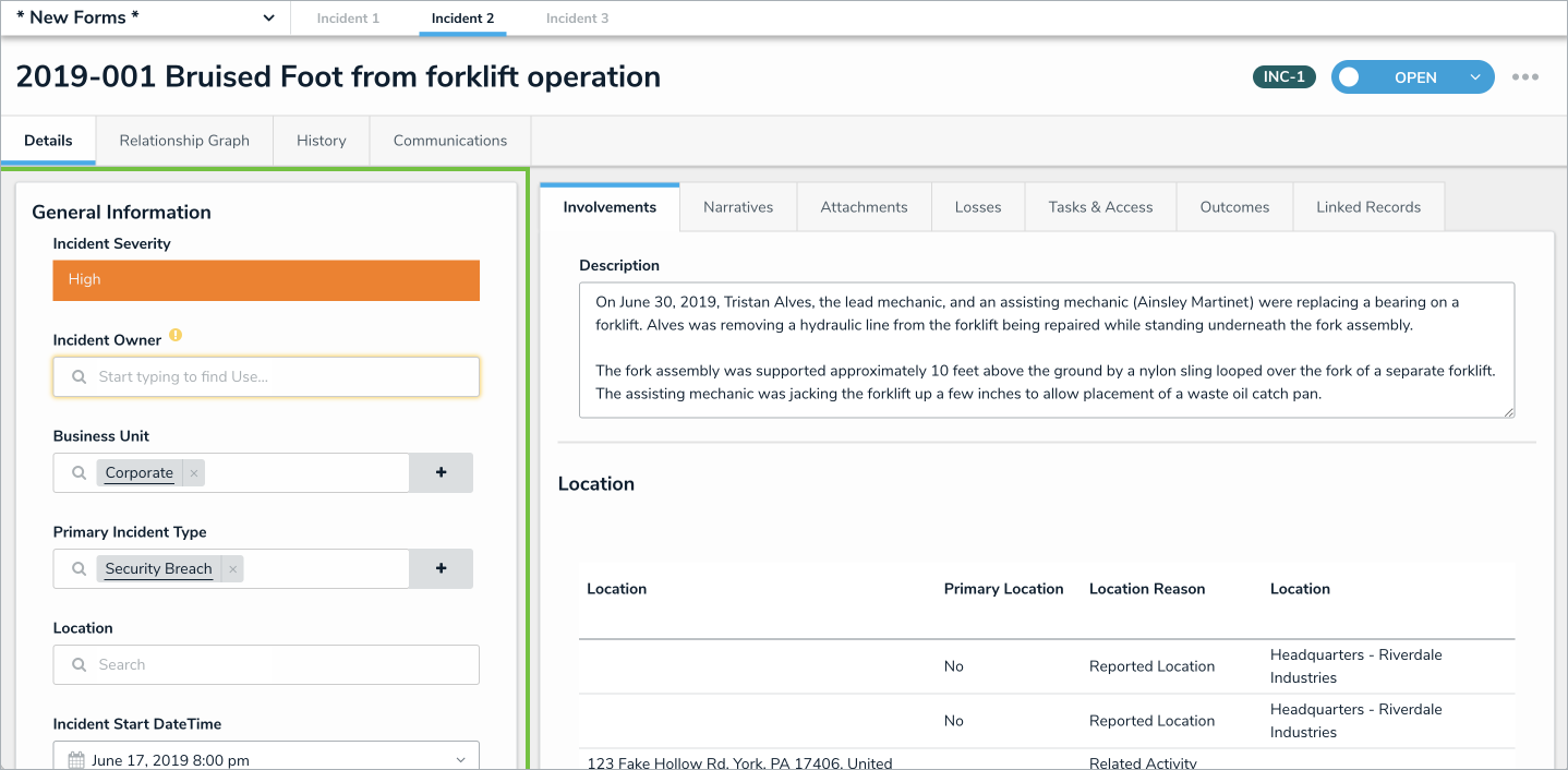
All form layouts display a separate object header at 100% width of the browser, with the form content underneath it. The form content can be split into two different sides – a 1 Column main form area or a 2 Column layout that has a left or right sidebar. With one-column form layouts, grey areas on the sides of the screen can be reduced to optimize the screen real estate for the form.
The sidebar option is a form card fixed to the left or right side and enables side-by-side cards for inline form content. Using this layout can also help breakdown long boxes of text, so your forms’ key details (i.e., the main object reference points) are presented in a more accessible way. While the sidebar may not be dragged and moved elsewhere in the form, sections and components within the sidebar can be reordered.
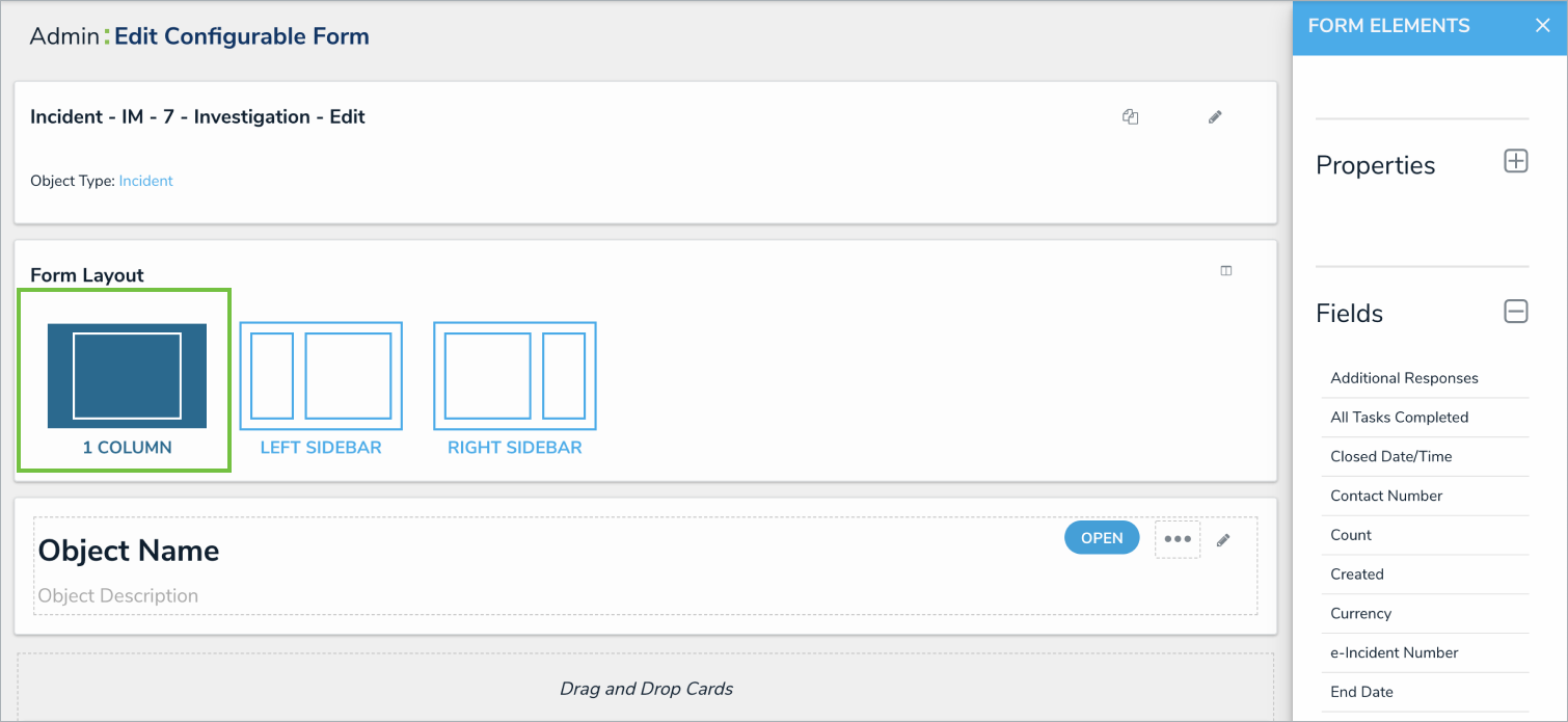 Select the 1 Column Form Layout.
1 Column Form Layout
This layout option displays all form cards, sections, and components only in the main form area. With the 1 Column layout, the main form area is a single column (66% screen width), possibly with multiple cards in it, positioned vertically.
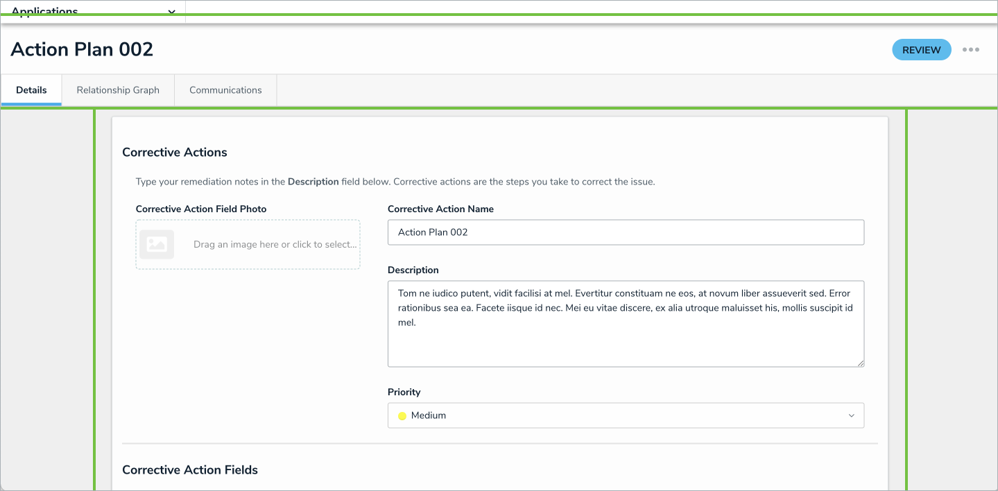 A 1 Column form.
Left Sidebar Form Layout
This layout separates the form content into a sidebar card on the left and a main form area on the right. In this layout option, the left sidebar should be used for general object information, so the application user has a quick reference on the object, while completing the actions in the main form area on the right. Example forms that use the left sidebar may include Collection types of forms, like Risk or Triage objects.
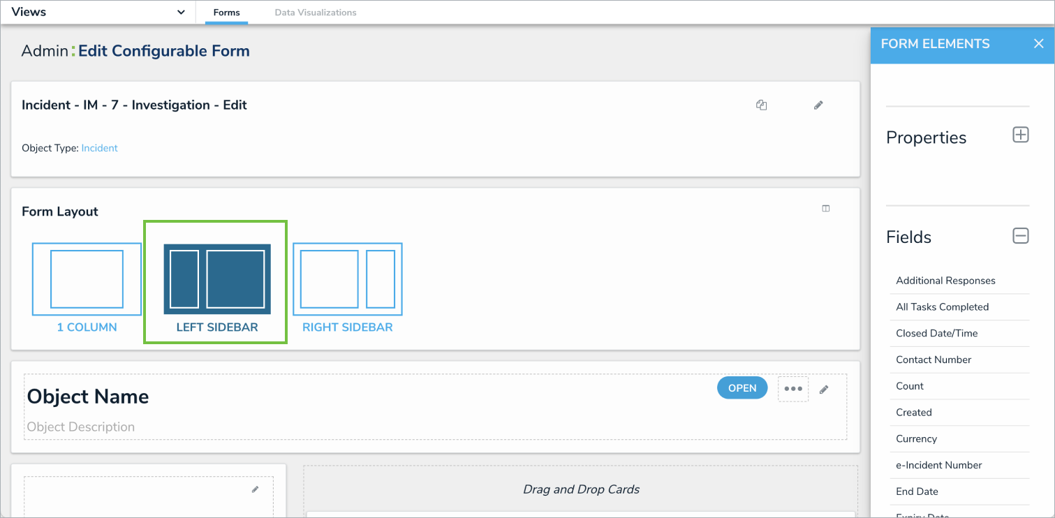 The Left Sidebar Form Layout.
 A Left Sidebar Form.
Right Sidebar Form Layout
This layout separates the form content into a sidebar card on the right and a main form area on the left. In this layout option, the right sidebar should be used for general object information, but also works well for adding secondary functions. Examples of these secondary details in the right sidebar includes report buttons, formulas, or statistics/scores.
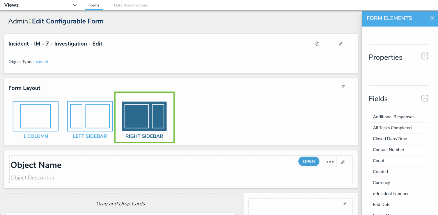 The Right Sidebar Form Layout.
| If you choose the right sidebar form layout, the card will get covered by the editor palette. Therefore, all reference information that an application user needs while working in the form should be placed into the main form area. |
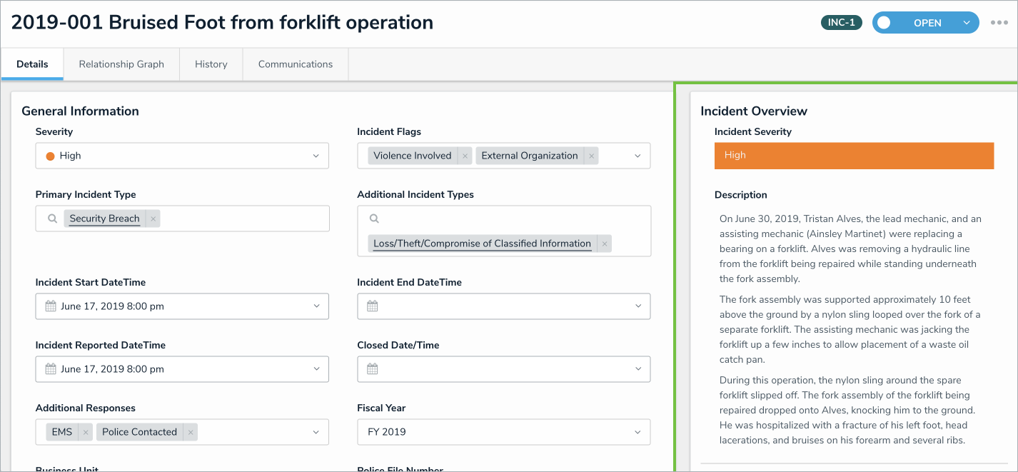 A Right Sidebar Form.
