Bar charts and column charts display numeric data based on the data definition selected.


Group By
When creating a bar or column chart, you can choose if the data is grouped by an object type or relationship. For example, in the screenshots above, the reports are displaying the number of times the Effective and Ineffective select list options appear on the Incident objects where each location has been referenced (e.g., the Montreal object has been selected on five Incident objects. Three of those Incident objects were effective, while two were ineffective).
When a chart isn't grouped, the number of times the selected field, formula, or state appears on a single object is totaled on the chart. For example, in the screenshots below, the data has not been grouped and the charts are therefore displaying the number of times the Effective and Ineffective select list options appear on the Incident objects at the Montreal location.


Instructions
To add a bar chart or column chart to a report:
- In the Elements section, click the
 icon beside Display.
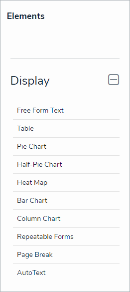 The Elements section.
 - Drag and drop Bar Chart or Column Chart from the Elements section to the Report Canvas.

Configurations for bar and column charts are identical. To change an existing bar chart to a column chart or vice versa, open the Edit Chart palette and select Bar or Column in the Configure Display section. - Select a data series from the Select a data series dropdown menu, then click Done. The data definition selected here will determine which object types you can choose to display in the chart.

Selecting a data series. - Choose the data types you'd like to display in the pie chart from the Data Type tab. Selecting LIBRARY DATA will include object type data, while selecting an Assessment Type will include the assessment name and workflow state. By default, all data types are selected. To make individual selections, deselect the Select All checkbox, then click the data type(s) you wish to include.
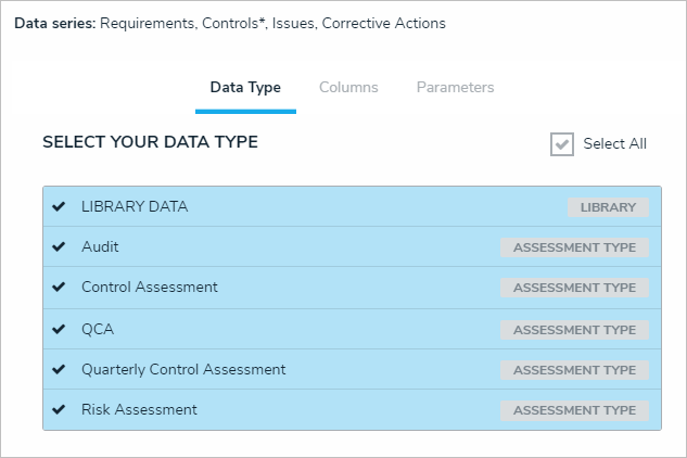 The Data Type tab.
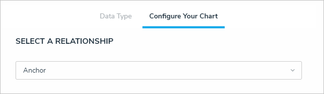
 - Click the Configure Your Chart tab.
- Choose the anchor or an object type in the data path from the Select a Relationship dropdown menu. The options in this dropdown menu will vary depending on the definition selected in the data series step above.
 Selecting which object type's data will appear in the report.
 - From the Select Data section, select the data (select list field, formula, or state) that you wish to display in the chart.

The Select Data section. You can only select one data type for each bar chart. - Optional: Select an object type or relationship from the Group Data dropdown menu. This selection will determine the legend to the left of the chart and the category of the data displayed. If the data is not grouped, a total count of the field, formula, or state selected in step 5 above will be displayed.

The Group Data section of Edit Chart palette. Your selection here will determine how the legend of the chart is displayed. - Optional: Enter a name for the chart in the Chart Title field.
- Optional: To display the chart as bars or columns, select either Bar or Column in the Configure Display section.
- Optional: If the data is grouped (see step 6), select the Column Totals checkbox to display a total count of the grouped data in each bar or column. If the data is not grouped, this option will be grayed out.
- Click Done when finished.
- Repeat the steps above to continue adding more bar or column charts to the report as needed. Once multiple elements are on the Report Canvas, you can rearrange them by hovering your cursor over the element, then clicking the
 icon and dragging the element to a new location on the canvas. To delete an element, hover your cursor over it, then click the
  icon.
icon.
 icon beside Display.


 icon and dragging the element to a new location on the canvas. To delete an element, hover your cursor over it, then click the
  icon.
icon.Once you're done adding elements and configuring your report, you must add it to a report view to make it available to end-users. See the Views Overview and Create a Report View articles for more information.