Overview
A Select List is a field type that allows users to select one or more options. You can create a Single Select List (select one option from the Field) or a Multi-Select List (select multiple options from the Field). Currently, the system only allows 1000 options per Select List.
Single Select Lists with five options or fewer can also be configured to display trending data when added to a standard form on an object type.
By default, Single and Multi-Select Lists appear on forms as dropdown menus. Admins can configure Single Select lists to appear as a group of buttons, provided the list has five options or fewer. To enable this option, see step 11 below.
User Account Requirements
The user account you use to log into Resolver must have Administrator permission to create a Select List.
Related Information/Setup
For more information on adding elements to configurable forms, see the Add Elements to a Standard Form, Fields on Forms, and Formulas articles.
Navigation
- From the Home screen, click the Administration icon.
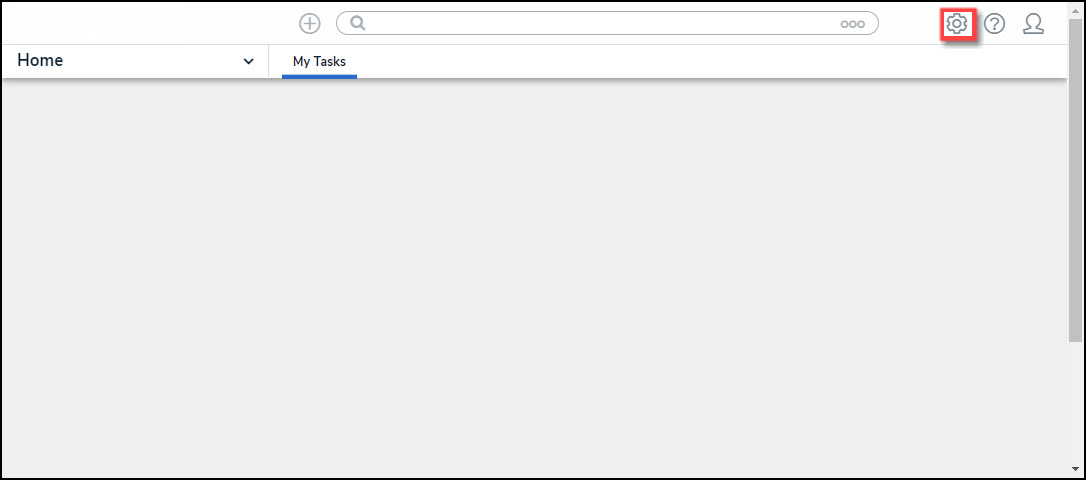
Administration Icon
- From the Admin Overview screen, click the Fields tile on the Data Model section.
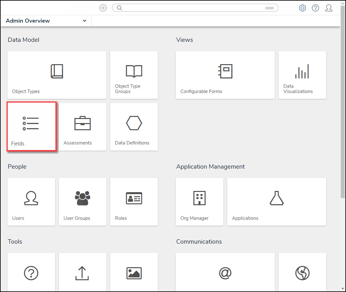
Fields Tile
- From the Admin: Fields screen, click on the + Create Field button.

+ Create Field Button
Create a New Select List Field
- From the Which type of Field would you like to create? screen, scroll to the Select List section.
- Hover your mouse over the Select List field and click the Create Field button.

Select List Field - Create Field
- From the Admin: Create a Field screen, and enter a Field Name in the Field Name field. The Field Name represents the Field in the system and will appear on Object Types within the system.
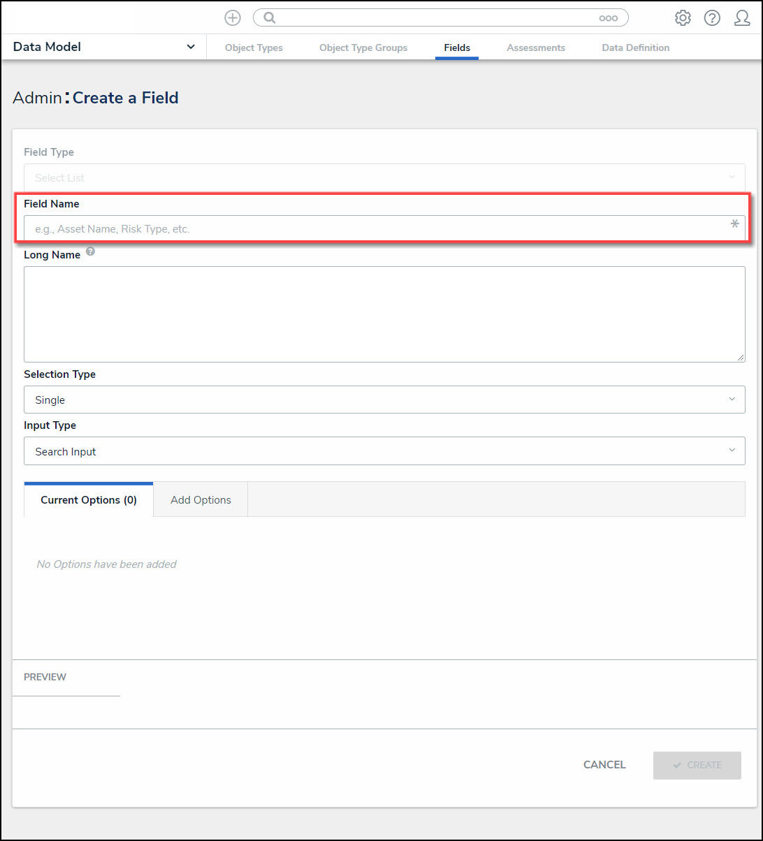
Field Name Field
- (Optional) Enter additional Field information or instructions in the Long Name text field. Long Names can be displayed on configurable forms.
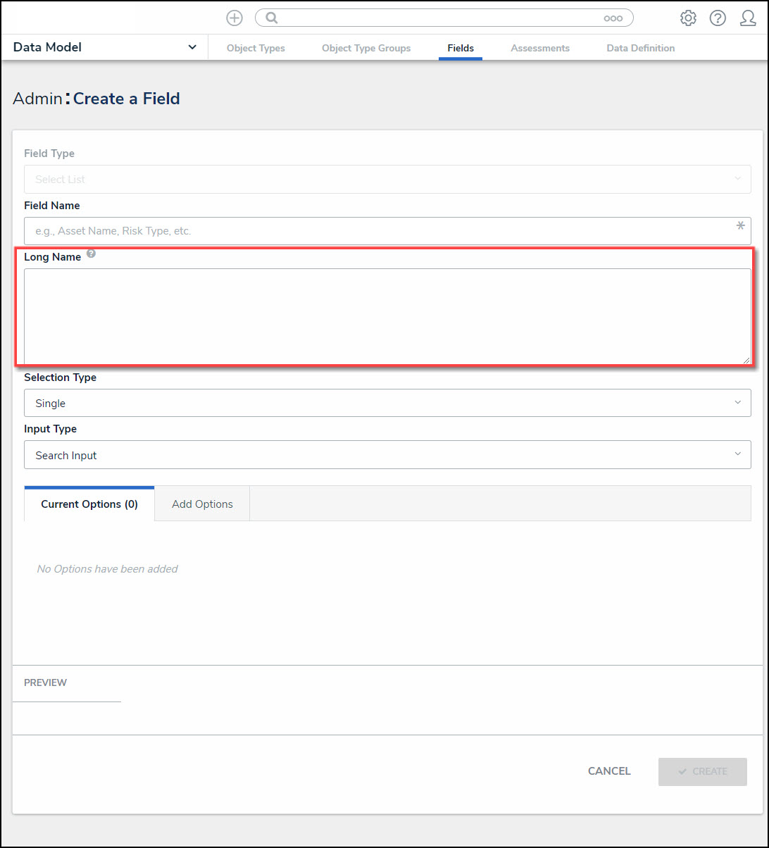
Long Name Text Field
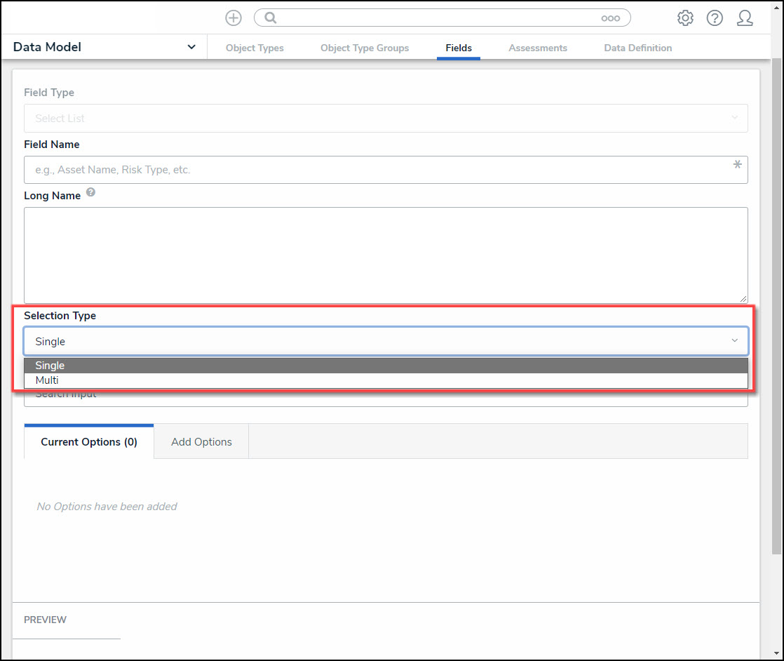
- Select a field type from the Selection Type drop-down:
- Single: A Single Select Listallows users to select only one option from the field. Only Single Select Lists are used as variables in formulas and conditions, as report filters, and as visual charts in reports.
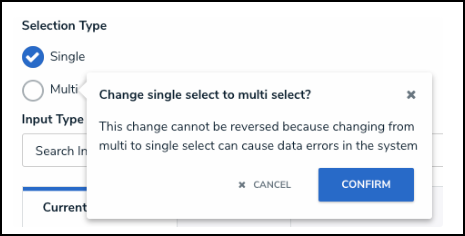
- When a Field is saved as a Single Select List, and it is changed from a single-select list to a multi-select list a Confirmation screen will appear, indicating that This Change cannot be reversed because changing from multi to single select can cause data errors in the system. Administrators must confirm the change by clicking the Confirm button on the Confirmation pop-up.
Confirmation Pop-up
- Multi: A Multi-Select List allows users to select more than one option from the field.
- When a Field is saved as a Multi-Select List, the Selection Type field is locked, preventing a user from changing to a Single Select List. Changing from Multi to Single can potentially cause data errors in the system, as a Single Select List field only allows one option.
Selection Type Drop-down
- Select an input type from the Input Type drop-down. When creating a Multi-Select List, the Input Type drop-down will not appear, and the Input Type will automatically default to Dropdown menu.

Input Type Drop-down
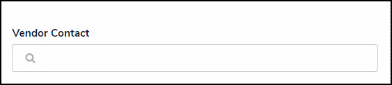
- Search Input: A Search Input Type allows users to use a search field to locate and select field options.
Search Input Type Field
- Dropdown: A Dropdown Input Type allows users to use a dropdown list to locate and select field options.
Dropdown Input Type Field
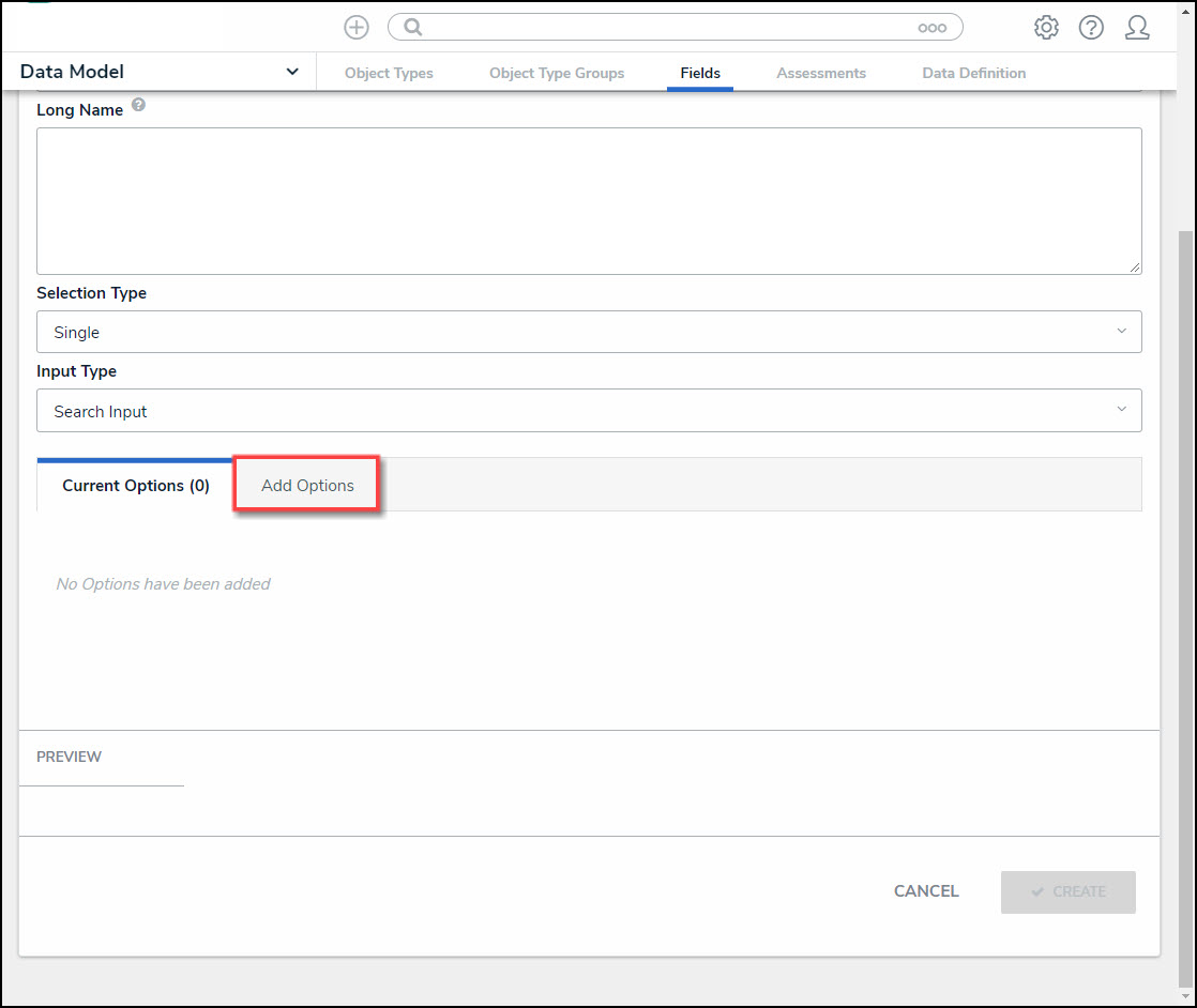
Adding Options to a Select List
- Click on the Add Options tab to add field options.
Add Options Tab
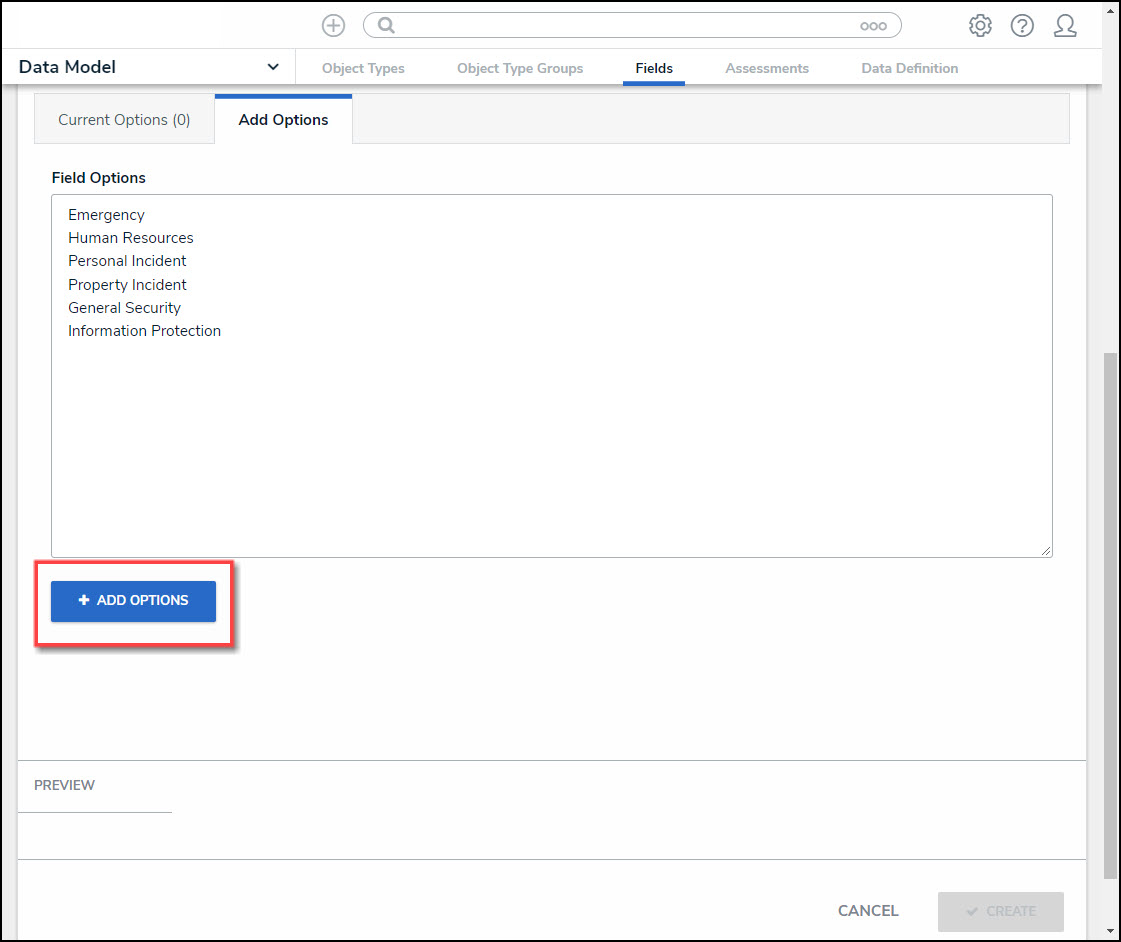
- Enter field options that will appear in the Input Type (e.g., Search Input or Dropdown) in the Field Options text box.
- You can add different field option elements on the same line if you use a comma (,) to separate the elements. Adding elements allows you to add Hex Color Codes and numeric values to a field option.
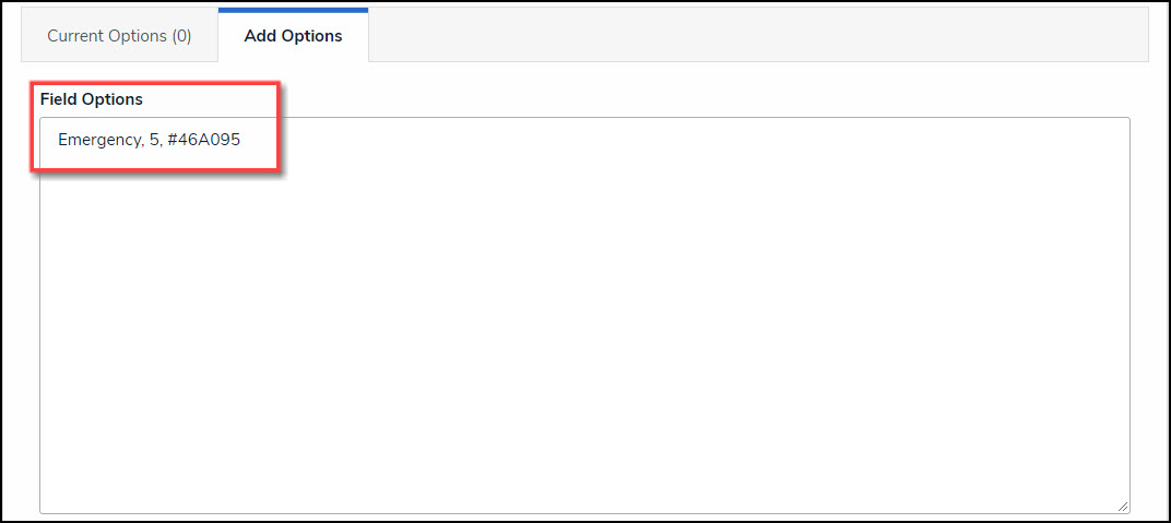
Field Option - Hex Code - Numeric Value
- You can add a total of 1000 options per field.
- You can use up to 300 characters (max) per option.
- Press the Enter key to separate each option using a line break.

Field Options Text Box
- Click the + Add Options button to add the Field options to the Current Options tab.
+ Add Options Button
- The number of field options added is displayed within the Current Options tab header.
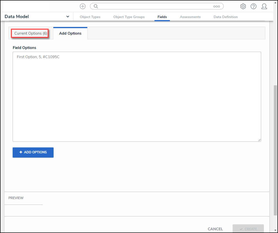
Current Options Tab Header
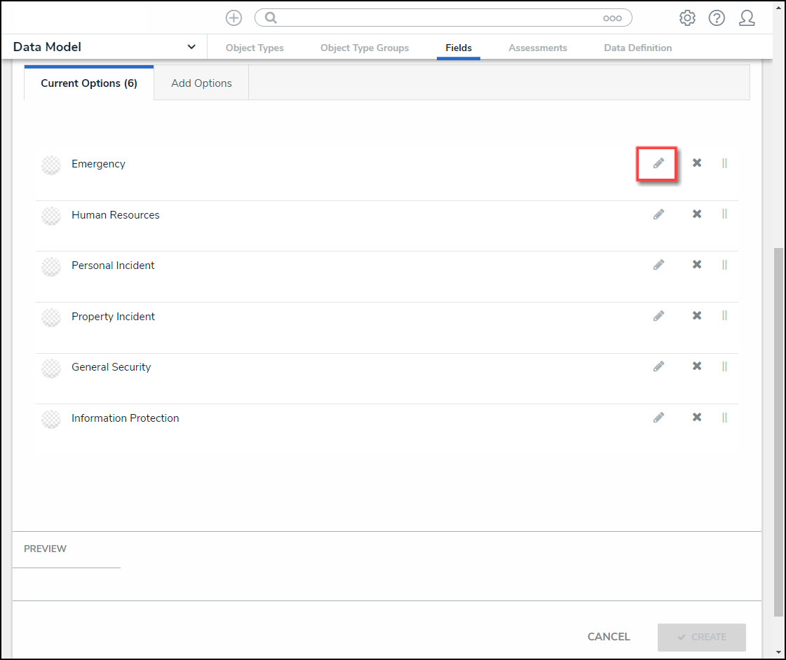
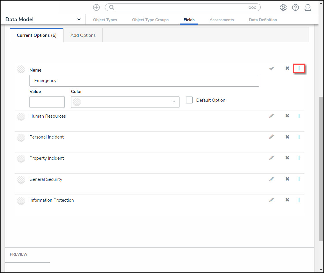
- Click on the Current Options tab.
- From the Current Options tab, click the Pencil (edit) icon next to an option to view/edit its settings.
Pencil (Edit) Icon
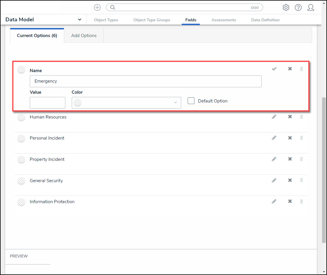
- (Optional) Edit the following Field Options Settings:
Field Options Settings
- Name: Enter a field option name. The Name represents the Field Option throughout the system.
- Value: Enter a numeric value. The Valueis used within Formulas throughout the system.
- The Value field will not appear if the field is a Multi-Select List as Multi-Select List cannot be used in Formulas.
- A Formula will display an Invalid Result error if it attempts to pull data from a Single Select List Field Option that does not have a value.
- Color: Click the Color dropdown menu to open the Colorpop-up. You can either click a color or type a hex color into this field. This color will appear next to the options in the Select List drop-down or search menu.
- Click on the + Favorite button to add the current color selection to a user-specific list of favorite colors (up to 10).

Color Pop-up
- Default Option: If the Default Option checkbox is selected, the system will automatically select the field option when it appears on an Object Type. A Default tag will appear next to the Field Option indicating that the Default Option Checkbox is selected.
- When changing the Default Option from one Field Option to another, any Objects previously saved with the original Default Options that have a Value:
- The Value will not update to reflect the new default Field Option's Value.
- The Value will not update to reflect the previous default Field Option's Value.
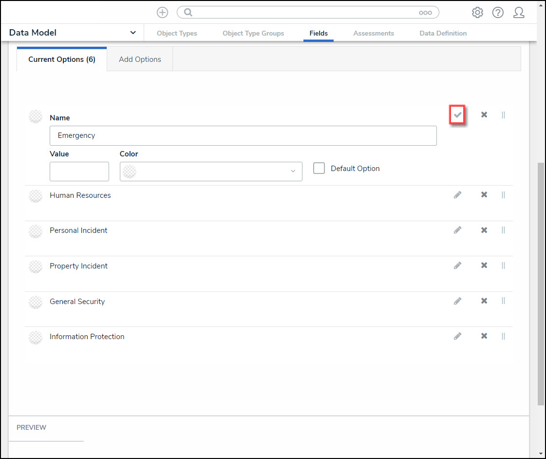
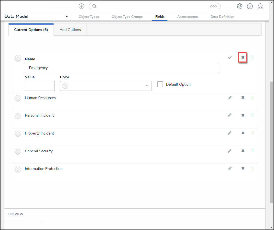
- Select the following icons in the Field Option Settings section:
- Confirm Icon: Click the Confirm icon to save any edits and close the settings for that Field Option.
Confirm Icon
- Delete Icon: Click the Delete icon to delete an option.
Delete Icon
- Rearrange Icon: Click and drag the Rearrange icon next to the option to reorder how the options will appear on the select list.
Rearrange Icon
- Click the Create button at the bottom of the screen to create the new field.
- The Preview section will preview how the field will look on a form.
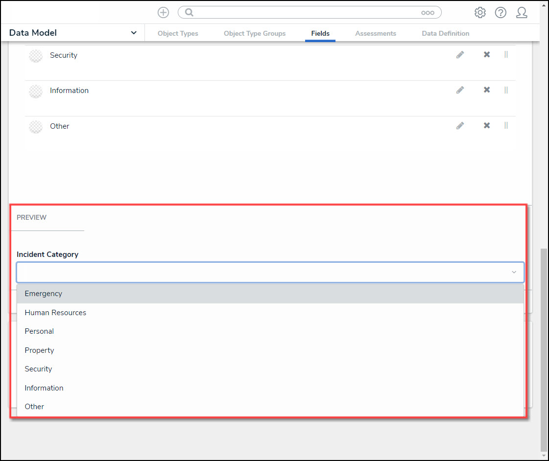
Preview Section