Overview
Resolver’s Dashboard Builder allows Administrators to build custom Dashboards using the Dashboard Data Sets published within their Org.
Charts are connected to Data Sets and can be applied to multiple Dashboards.
Before using the Dashboards feature, at least one Dashboard Data Set needs to be created and published.
The following instructions apply to Bar, Line, Symbol, Funnel, Pie, Min/Max, and Word Cloud Chart Types.
 Warning:
All changes or edits made to a Chart are globally applied across all instances of that Chart. Create a duplicate Chart to apply changes or edits that will not affect the original Chart.
User Account Requirements
The user account you use to log into Resolver must have Administrator permission or Data Management advanced permissions to add a chart to a Dashboard.
Related Information/Setup
To create a new Dashboard Data Set, please follow the link below:
After creating a Dashboard Data Set, the user must publish it before it can be used with the Dashboard Data Set Builder. Please follow the link below for more information on Publishing a Dashboard Data Set.
To add styles to your Chart, please see follow the link below:
For Information on Adding a Chart Type not covered by these instructions please see the corresponding articles below.
- Adding a Multi-Series Chart to a Dashboard
- Adding a Combo Chart to a Dashboard
- Adding a Table to a Dashboard
- Adding a Crosstab to a Dashboard
- Adding a Heatmap to a Dashboard
- Adding a Box and Whiskers Chart to a Dashboard
Navigation
- From the Home screen, click the Administration icon.
![]()
Administration Icon
- From the Administrator Settings menu, click the Admin Overview link.

Administrator Settings Menu
- From the Admin Overview screen, click on the Dashboard Builder tile under the Views section.

Dashboard Builder Tile
- From the Dashboard Builder screen, click on a Dashboard Name.
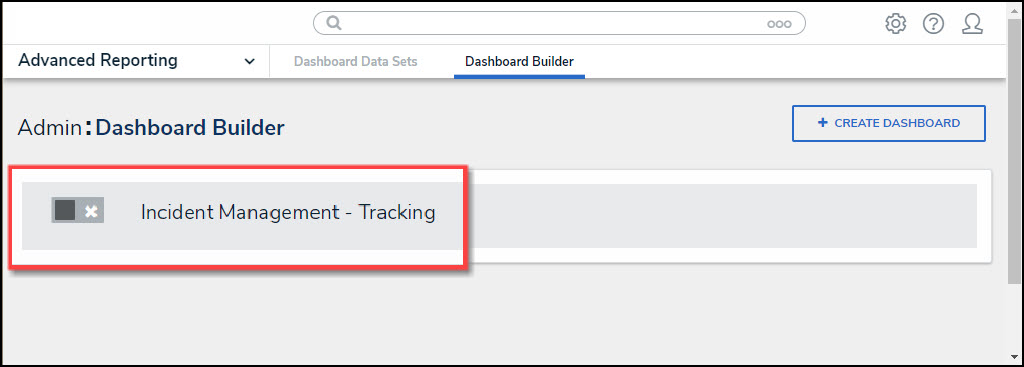
Dashboard Name
Adding a Chart to a Dashboard
Only Unpublished Charts can be edited.
For illustration purposes, were are going to use the Bar Chart Type in the instructions below; however, you can also apply these instructions to Line, Symbol, Funnel, Pie, Min/Max, and Word Cloud Chart Types.
- From the Canvas Layout screen, click the Add Chart button.
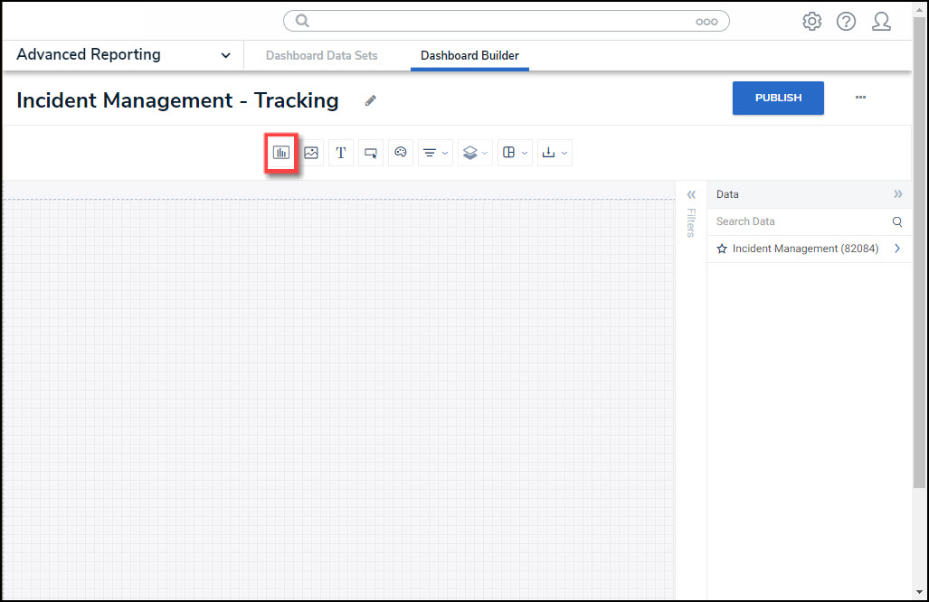
Add a Chart Button
- From the Chart screen, click on a Dashboard Data Set from the Data Panel.
Note:
Only published Dashboard Data Sets will appear on the Data Panel.

Dashboard Data Set
- Click in the Chart Header (Untitled Chart) field and enter a Chart Name. The first 36 characters will show in the Chart Header.
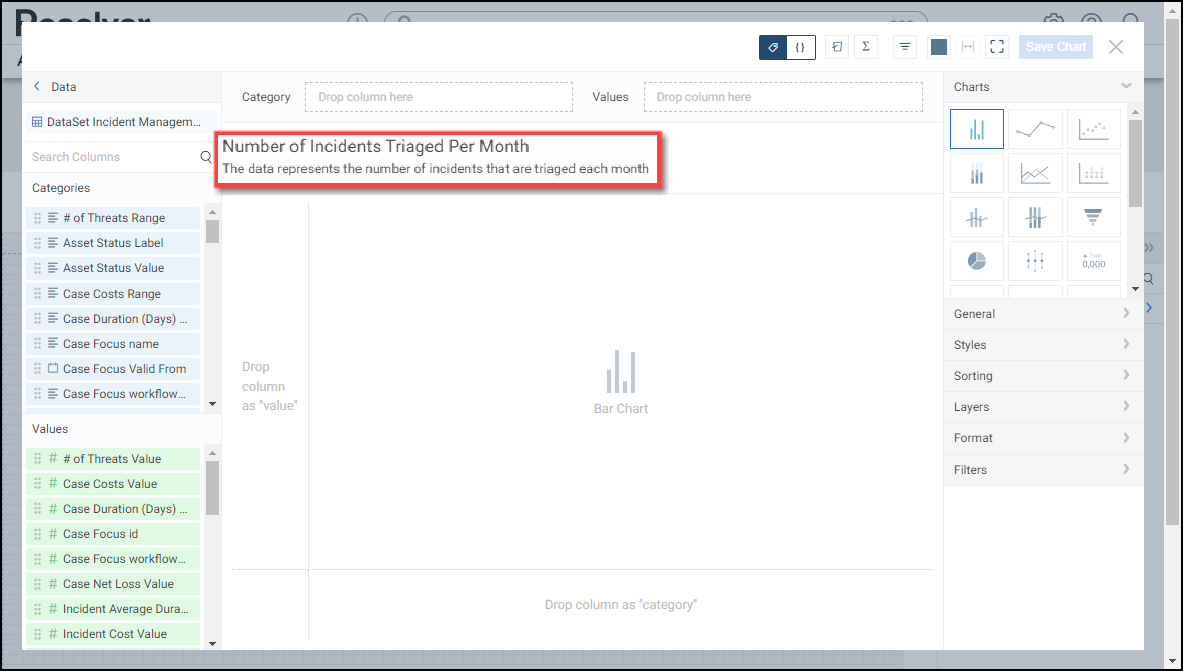
Chart Header and Description
- Click in the Add Description field and enter a Chart Description. The Chart Description will appear on the Data Panel under the Chart section and popup when hovering your cursor over a Chart Name.
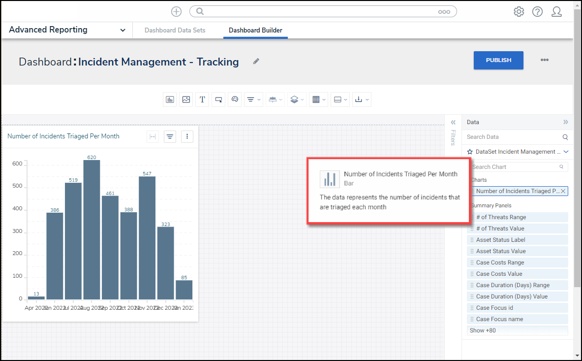
Chart Description
- Dashboard Data Set Categories and Values will appear under the Dashboard Data Set Name on the Data Panel.
- Categories (Blue): Categories are text and data columns used to group data (e.g., Sales Region, Department Name, Order Dates, etc.).
- Values (Green): Values are numeric columns used to calculate data. Values can also be aggregated (e.g., Average Price Per Product, Total Sales Revenue, etc.).
- Categories and Values have a Data Type icon next to the Dashboard Data Set Name. Data Type icons indicate the Category and Value Data Type:
|
|
|
|
|
- Drag and drop a Category from the Data Panel onto the Category section at the bottom of the Chart (traditional x-axis) or within the Category field at the top.

Drag and Drop a Category
- The Category data will populate the Chart. Bar Chart is the system default for Chart types.

Chart
- (Optional) Drag and drop a Value from the Data Panel into the Value section at the Side of the Chart (traditional y-axis) or within the Value field at the top.

Drag and Drop a Value
- You can select different Chart Types from the Charts section on the Configuration Panel by clicking on the corresponding Chart icon.

Chart Types
- The following outlines the currently available Chart Types:
- Bar Chart: Bar Charts compare categorical aggregate values. For example, a Bar Chart compares the amount/percentage of a population that attends various categorical events. Users can create Horizontal or Vertical Bar Charts.
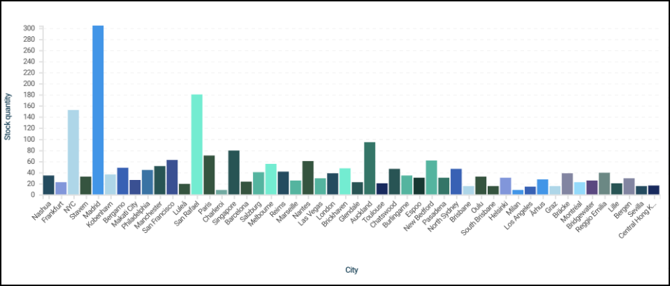
Bar Chart
- Line Chart: Line Charts show changes in an aggregated value over a continuous dimension (Category), usually time. For example, a Line Chart shows the number of orders placed over time.
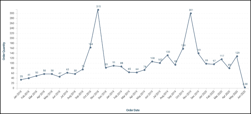
Line Chart
- Symbol Chart: Symbol Charts show aggregated values emphasizing the highest and lowest data points.
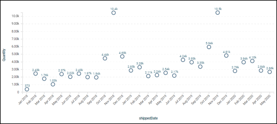
Symbol Chart
- Funnel Chart: Funnel Charts display data values as progressively decreasing/increasing proportions that add to the total. Each stage of the Funnel Chart is determined by the corresponding value (as a percentage of all values) and is represented in segments. The category order depends on the how the chart is sorted.

Funnel Chart
- Pie Chart: A Pie Chart is a circle divided into slices. The pie represents 100% of the data points selected. Each slice represents a different category.

Pie Chart
- Min/Max Chart: A Min/Max Chart shows a category's Minimum, Maximum, and Average values, showing the range of a measure, like minimum and maximum temperature recorded for each day of the month.
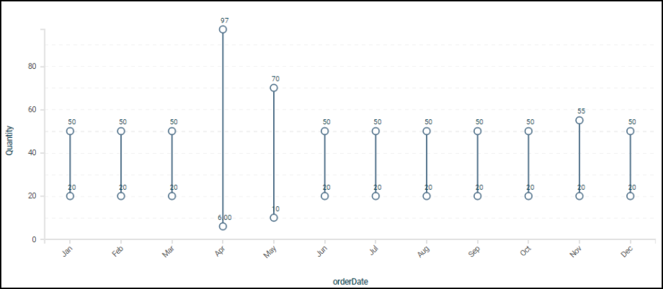
Min/Max Chart
- Word Cloud: A Word Cloud is a visual representation of text data in which the importance or frequency of individual words is represented using the font size. The more important or frequent a word is, the larger it appears.
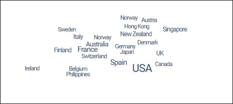
Word Cloud
- Radar Chart: The Radar Chart is a new dashboard type which allows users to show object on a polygon grid, depicting category values as poles and the value column aggregates for each category are points on the poles. Points on the grid are connected with a line, creating a polygon. The horizontal axis represents likelihood, and the vertical axis represents impact severity. A radar chart helps visualize distribution and relationships, highlighting critical issues that need attention.

Radar Chart
- Click the Save Chart button to save your changes and return to the Dashboard screen

Save Chart Button