Overview
A Comparison Chart compares a selected value to one from a different period.
User Account Requirements
The user account you use to log into Resolver must have Administrator permission to add a Comparison to a Chart.
Related Information/Setup
To add styles to your Chart, please see the link below:
Please see the corresponding articles below for Information on Adding a Chart Type not covered by these instructions.
- Adding a Chart to a Dashboard
- Adding a Multi-Series Chart to a Dashboard
- Adding a Combo Chart to a Dashboard
- Adding a Table to a Dashboard
- Adding a Crosstab to a Dashboard
- Adding a Heatmap to a Dashboard
- Adding a Map to a Dashboard
- Adding a Box and Whiskers Chart to a Dashboard
Navigation
- From the Home screen, click the Administration icon.
![]()
Administration Icon
- From the Administrator Settings menu, click the Admin Overview link.

Administrator Settings Menu
- From the Admin Overview screen, click on the Dashboard Builder tile under the Views section.

Dashboard Builder Tile
- From the Dashboard Builder screen, click a Dashboard Name.
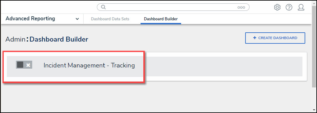
Dashboard Name
- From the Dashboard screen, to access the Chart screen, click on the Add Chart button.

Add Chart Button
- Or click the More Options icon on an existing Chart View.
![]()
More Options Icon
- Click the Edit option from the More Options dropdown menu.

Edit Option
- From the Chart screen, click the Comparison panel from the Configuration panel.

Trend Chart Panel
Adding a Comparison Chart
- Drag and drop a Category from the Categories panel into the Date Column field.

+ Add Trend Chart Link
- Select the first period from the Time Period dropdown menu (e.g., All History, This Year, Last Hour, etc.).
- Select the second period from the Comparison dropdown menu (e.g., All History, This Year, Last Hour, etc. ). The data from the Data Column will use the periods selected in the Time Period and Comparison dropdown menu to compare the two values.

Time Period/Comparison Dropdowns
- Click the +Add Comparison Column link to add the Comparison Chart. The Comparison Column 1 link will appear under the +Add Comparison Column link.

Comparison Column 1 Link
- Click the Comparison Column 1 link, and the following fields will appear:
- Column: Select the Column from the Column dropdown menu that the system will use for the comparison. Only the Comparison Columns you have added will appear on the dropdown menu.
- Type: Select how the Comparison values are displayed on Chart Tooltips:
- Percent Change: Shows the Comparison value using percentages.

Percent Change
- Difference: Shows the Comparison value using numerical values.

Difference
- Increasing Change: The Increasing Change field allows users to select the icon (Triangle Up, Triangle Down, or No Icon) and icon color (pick a color from the Color Palette pop-up) used to represent an increase in the Comparison value.
- Decreasing Change: The Decreasing Change field allows users to select the icon (Triangle Up, Triangle Down, or No Icon) and icon color (pick a color from the Color Palette pop-up) used to represent a decrease in the Comparison value.
- No Change: The No Change field allows users to select the icon (Circle or No Icon) and icon color (pick a color from the Color Palette pop-up) used to represent no change in the Comparison value.
- Show Value: The Show Value option includes or excludes the Comparison value on the Chart.
- Remove: Select the Remove link to delete the Comparison Column from the Chart.
- Click the Save Chart button to save changes made to the Chart.