If needed, up to six additional data points from a single object type can be added to the heat map. For example, you may need to create a heat map that shows an Inherent Risk data point using the Inherent Impact and Residual Likelihood formulas together with the Residual Risk data point using the Residual Impact and Residual Likelihood formulas.
 | Adding or removing a range or option from a formula or select list currently added to an existing heat map will require that an admin clicks Regenerate Heat Map in the settings to refresh the report and ensure it displays correctly. |
 | It’s recommended a table is created with heat map reports. This allows users to open individual objects in cells that contain 10 objects or more, and provide additional information about the objects. |
For information on creating a heat map with a single data point, see the Add a Heat Map with a Single Data Point article.
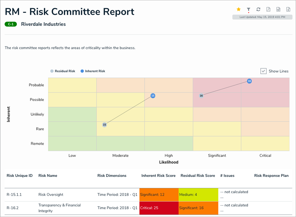 A heat map with multiple data points.
Labels
Labels displayed in the X and Y axes are pulled from the first data point added to the heat map. Additionally, each data point is displayed in a legend and assigned one of the following preset color codes, based on the order each data point was created:
- #bccdda
- #498edf
- #8b49df
- #103765
- #8c836a
- #677682
Admins can name the X and Y axes with custom labels that will appear outside the select list field/formula labels on the axes and can configure the map to display lines between objects that appear more than once through multiple data points.
Instructions
To add a heat map with multiple data points to a report:
- In the Elements section, click the
 icon beside Display.
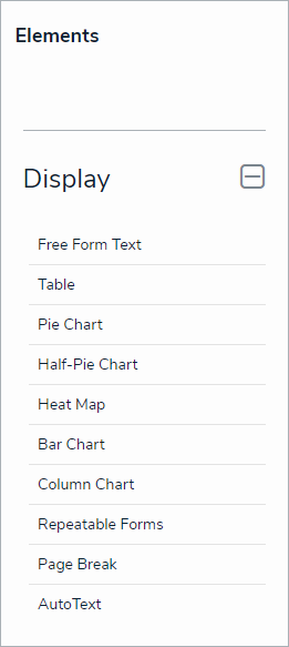 The Elements section.
 - Drag and drop Heat Map from the Elements section to the Report Canvas.
- Select a data series from the Select a data series dropdown menu, then click Done. The data definition selected here will determine which object types you can choose to display in the heat map.

Selecting a data series. - Choose the data types you'd like to display in the heat map from the Data Type tab. Selecting LIBRARY DATA will include object type data, while selecting an Assessment Type will include the assessment name and workflow state. By default, all data types are selected. To make individual selections, deselect the Select All checkbox, then click the data type(s) you wish to include.
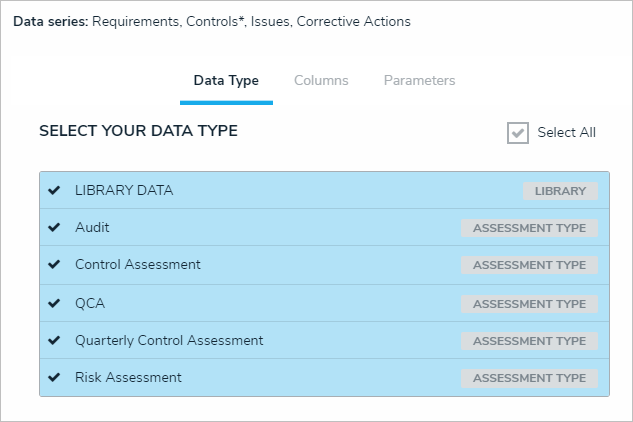 The Data Type tab.
 - Click the Configure Your Chart tab.
- Choose either the anchor or an object type in the data path from the Select a Relationship dropdown menu. The options in this dropdown menu will vary depending on the definition selected as the data series in the step above.
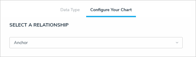 Selecting which object type's data will appear in the heatmap.
 - Choose a select list or formula saved to the object type from the X-Axis and Y-Axis dropdown menus. These selections will populate the cell labels in the X (bottom) and Y (left) axes on the report.
The select list or formulas selected for the first data point determine which cell labels are displayed on the heat map. - Optional: Enter a name for the data point in the legend in the Text label for data legend field. If this field is left blank, the data point will be assigned a Series # title by default. The number assigned to the series name is determined by the order the data point was created (i.e., Series 1, Series 2, Series 3, etc.).
- Click Add More.
- Choose a select list or formula in the X-Axis and Y-Axis dropdown menus to create an additional data point, then enter an optional name for the data point in the legend in the Text label for data legend field.
- Continue adding more data points as needed. Up to six data points can be added per heat map.
- Optional: Enter names in the X-Axis and Y-Axis fields in the Custom Axis Labels section to include a title for the axes on the map.
- Click Regenerate Heat Map in the Configure Colors section to show a preview of the heat map.
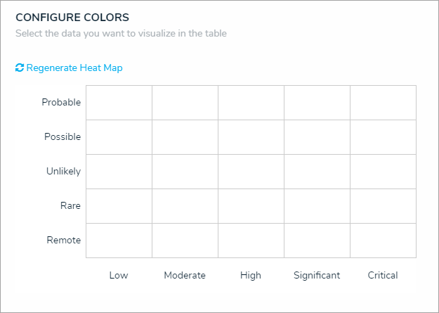
A preview of the heat map. Clicking Regenerate Heat Map will display the colors on the map for adjustment as needed. The heat map preview will not display data point legends or connector lines. - To adjust the cell colors:
- Click a cell to display the color picker.
- Enter a hex color code in the text box or select a preconfigured shade from the Palette section.
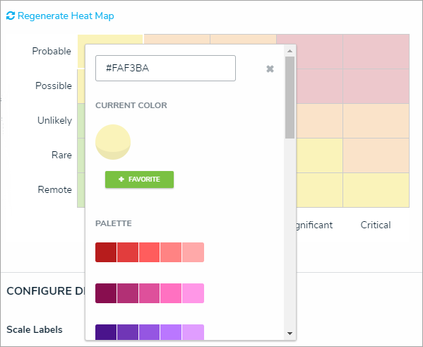 The heat map color picker.
- Optional: Click + Favorite to save the color. Up to ten colors can be added and can be accessed when configuring the settings for all heat maps in your organization. To remove a favorite color, click it, then click - Favorite.
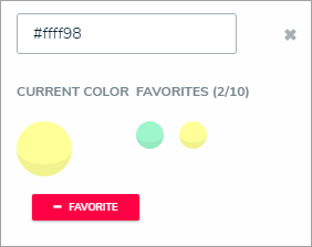 Favorite colors. Up to ten can be added.
- Click the x or click outside the picker to close it, when finished.
- To reset the cell colors to their defaults, click Regenerate Heat Map.
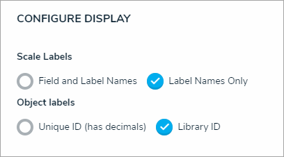
- In the Scale Labels section, select Field and Label Names to display the name of the select lists or formulas alongside the cell labels. Select Label Names Only to display the select list options or formula labels only.
- In the Object Labels section, select the Unique ID (has decimals) option if you want to display the decimals of any assessment instances (e.g., 32.1). Select Library ID if you do not want decimals displayed (e.g., 32).
 The Configure Display section.
 - In the Connect Lines section, select the Display Lines checkbox to allow end users to enable lines between objects that appear more than once on the map through multiple data points. If this checkbox is selected, you can toggle the Show Lines By Default option to show the lines automatically once the report has loaded.
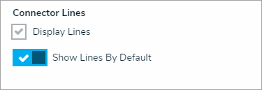 The Connector Lines section.
 - From the Define Custom Forms dropdown menu, select which form is displayed when a user clicks on data in the heat map. These options are determined by the object type selected in the Select a Relationship dropdown menu above. Choosing Default will display the form selected in the user’s role permissions for the object type.
- Click Done when finished.
 icon beside Display.


Once you're done adding elements and configuring your report, you must add it to a report view to make it available to end-users. See the Views Overview and Create a Report View articles for more information.