Overview
The Format function on the Chart screen allows users to add formatting to a Chart in two different ways: Small Multiples or Conditional Formatting.
 Warning:
All changes or edits made to a Chart are globally applied across all instances of that Chart. Create a duplicate Chart to apply changes or edits that will not affect the original Chart.
User Account Requirements
The user account you use to log into Resolver must have Administrator permission or Data Management advanced permissions to format a Chart using Small Multiples and Conditional Formatting.
Related Information/Setup
To add styles to your Chart, please see the link below:
Please see the corresponding articles below for Information on Adding a Chart Type not covered by these instructions.
- Adding a Chart to a Dashboard
- Adding a Multi-Series Chart to a Dashboard
- Adding a Combo Chart to a Dashboard
- Adding a Table to a Dashboard
- Adding a Crosstab to a Dashboard
- Adding a Heatmap to a Dashboard
- Adding a Map to a Dashboard
- Adding a Box and Whiskers Chart to a Dashboard
Navigation
- From the Home screen, click the Administration icon.
![]()
Administration Icon
- From the Administrator Settings menu, click the Admin Overview link.

Administrator Settings Menu
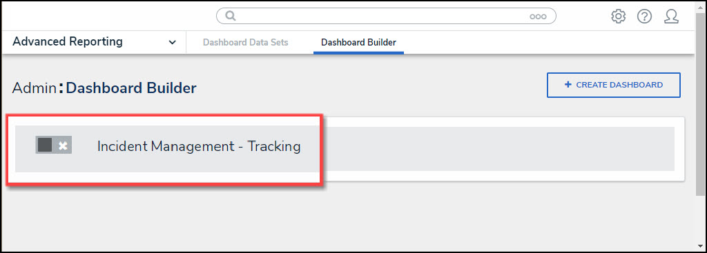
- From the Admin Overview screen, click on the Dashboard Builder tile under the Views section.

Dashboard Builder Tile
- From the Dashboard Builder screen, click a Dashboard Name.
Dashboard Name
- From the Dashboard screen, to access the Chart screen, click on the Add Chart button.

Add Chart Button
- Or click the More Options icon on an existing Chart View.

More Options Icon
- Click the Edit option from the More Options dropdown menu.

Edit Option
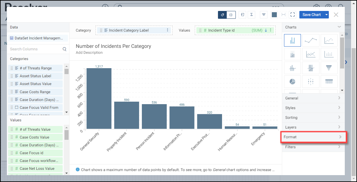
- From the Chart screen, click the Format panel from the Configuration panel.

Format Panel
Adding Small Multiples to a Chart
Small Multiples allows a user to create multiple charts using the same data set, scale, and axes to pull out different data groups creating data comparisons between the different Charts. Small Multiples add a new data Column to the Chart used to create the data groups. An example would be sales per month by country, where the country value would be the added Column to a Chart already using sales per month as the Category and Value.
The Small Multiples feature can be applied to Bar, Line, Symbol, Min/Max, Multi-Series Bar, Multi-Series Line, Multi-Series Symbol, and Combo Charts.
- Click the Format panel.
Format Panel
- Click the Small Multiples panel.

Small Multiples Panel
- Drag and drop a Category from the Categories panel to the Drop Column Here field under the Small Multiples panel.

Drag and Drop Category
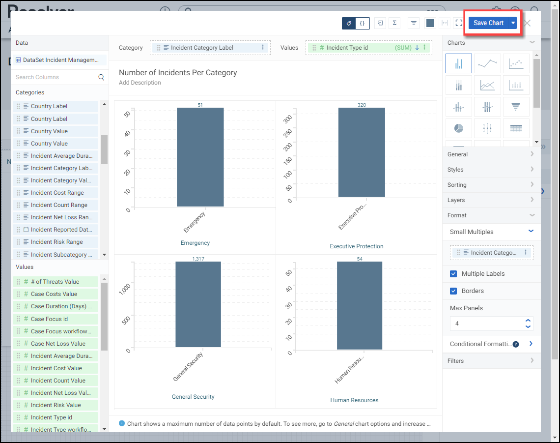
- The Chart screen will refresh, applying the data value information from the Small Multiples Column to the Chart dividing the Chart into multiple Charts based on the number of values in the Small Multiples Column.

Chart Canvas
- Click the Multiple Labels checkbox to enable or disable the Small Multiples Column Value labels on the Chart. By default, the Multiples Labels checkbox is enabled.

Multiple Labels Checkbox
- Click the Borders checkbox to enable or disable borders between the Charts. By default, the Borders checkbox is enabled.

Borders Checkbox
- Click the Max Panels field and enter the number of panels you what to display on the Chart, or use the increase and decrease arrows to adjust the Max Panels value. The Max Panels field controls the number of Charts that appear on the Chart Canvas. By default, the Max Panels field is set to 50.

Max Panels Field
- Click the Save Chart button to save changes to the Chart.
Save Chart Button
Adding Conditional Formatting to a Chart
The Conditional Formatting feature allows users to apply a style to the chart when the data meets certain criteria defined in a condition.
The Conditional Formatting feature can be applied to Bar, Line, Symbol, Table, Expandable Table, Crosstab, Multi-Series Bar, Multi-Series Line, Multi-Series Symbol, Combo, Dot Map, Bubble Map, Funnel, and Pie Charts.
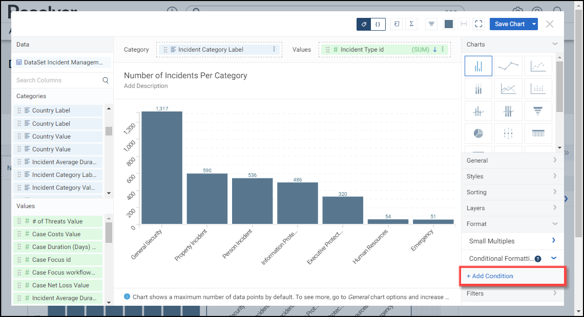
- Click the Conditional Formatting panel.

Conditional Formatting Panel
- Click the +Add Conditional link.
+Add Conditional Link
- A new Condition panel will appear under the Conditional Formatting panel called Condition 1. Click the Condition 1 panel to open the condition options:

Condition 1 Panel
- Color: The Color option allow users to select a color from the color palette to represent the Condition on the Chart when the criteria is met.
- Style: The Style option allows users to select the style the Condition uses when applied to the Chart (filled or outlined).
- Label: Select the Label field and enter a Conditional label. The Label option allows users to add a custom label for the Condition. The Label will replace the default Condition 1 label used on the panel and appear on a Tooltip when hovering over a Condition on the Chart.

Label
- Column: Select a Column from the Column dropdown. The Conditional Formatting is applied to the Column selected.
- Operator: Select an Operator from the Operator dropdown. The Operator is applied to the value to create the Condition that must be met for the formatting to appear on the Chart.
- Equals: If a value(s) on the Chart equals the Value in the Value field, the Condition is met.
- Does Not Equal: If a value(s) on the Chart does not equal the Value in the Value field the Condition is met.
- Less Than: If a value(s) on the Chart is less than the Value in the Value field, the Condition is met.
- Greater Than: If a value(s) on the Chart is greater than the Value in the Value field, the Condition is met.
- Less Than or Equal to: If a value(s) on the Chart is less than or equal to the Value in the Value field, the Condition is met.
- Greater Than or Equal to: If a value(s) on the Chart is greater than or equal to the Value in the Value field, the Condition is met.
- Between, Inclusive: If a value(s) on the Chart is within the value range, including the edge values, the Condition is met (e.g., 0 - 500, will include the edge values 0 and 500). An extra Value field is added when using Between, Inclusive, which allows users to create a value range by entering a numerical value in each Value field. The first Value field is the min value in the range.
- Between, Exclusive: If a value(s) on the Chart is within the value range, excluding the edge values, the Condition is met (e.g., 0 - 500, will exclude the edge values 0 and 500). An extra Value field is added when using Between, Exclusive, which allows users to create a value range by entering a numerical value in each Value field. The first Value field is the min value in the range.
- Is Null: If a value(s) on the Chart equals null (0), the Condition is met. The Value field is removed and is not used when Is Null is selected.
- Is Not Null: If a value(s) on the Chart does not equal null (0), the Condition is met. The Value field is removed and is not used when Is Not Null is selected.
- Value: Enter the value(s) the Condition must meet for the Formatting to apply to the Chart.
- Apply to: Select an Apply to option from the dropdown menu. The Apply to option will appear for certain Charts (e.g., Tables). The Apply to option allows users to select the area of the Chart that the Conditional Formatting will apply (e.g., Entire Row or specific column).
- Click the Remove link to delete the Conditional Formatting from the Chart.

Remove Link
- Click the Save Chart button to save changes to the Chart.
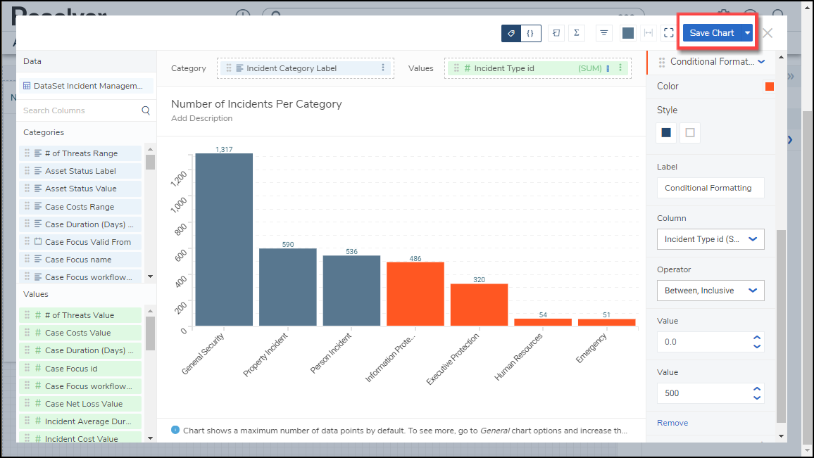
Save Chart Button