A form card refers to a primary group of content within a standard form – either in the Sidebar Card, or within the main form area. Administrators can add multiple form cards to the main form area, to help to clearly separate form content. Then you may also add form sections, which function as secondary content groups within unique form cards.
 The left sidebar card and main form card area.
| An upper-level card tab title acts as the card title – therefore the first section within the card does not require a title. Unless you add several sub-sections within the card tab to chunk content together. That’s when each of these sub-sections must have its own title. Read more here: Add a Section to a Form. |
To add a new card to a form:
- Create a new form or open an existing form by clicking the
 icon in the top bar Configurable Forms> Views panel, then selecting the relevant form.
 - Click the +CARD button found right at the bottom of the form’s canvas. Your new card will appear there, just above that +CARD button.
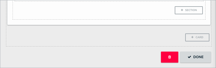 The +CARD button on a form.
 - Click the
 icon in the top-right corner of the new section to display the Edit Form Card screen.
 - Enter text in the Card Title to provide a header to the card.
- Whether you’re working in the left/right sidebar or in the main form area, all cards should begin with a title.
- Optional: To reposition any form card on a form canvas:
- Click the
 icon in the top-right corner of the relevant card.
 - Drag and drop that form card to the top of the canvas and release when the green highlight appears. The repositioned card will now display at the foot of the form canvas.
- Continue dragging and dropping the other form cards into the top of the form canvas, until the relevant form card displays in the intended position.
- Click the
- Optional: Click the Make Card Collapsible toggle, where you will select either:
- Expanded (to show the section’s contents by default)
- Collapsed (to hide the section’s contents by default), below Collapsible Default on Load.
- Optional: To create card-level tabs:
- Click the Enable Tabs icon.
- Click +Add Another Tab.
- Enter a name for the tab in the text field.
- Continue steps a-c to continue adding more tabs as needed. To delete a tab, click the X icon.
- Click DONE to return to the form canvas.
- Optional: If the new card is collapsible, click the + icon to expand it and add form sections.
 icon in the top bar Configurable Forms> Views panel, then selecting the relevant form.
 icon in the top-right corner of the new section to display the Edit Form Card screen.
 icon in the top-right corner of the relevant card.
Important Notes
- Avoid replicating the default header navigation (i.e., Details, Relationship Graph, History, Communications) when enabling new card tabs.
- The number of card tabs you create should not exceed seven, depending on the length of each tab’s name (limit them to one or two words).
- If you have a lot of tabs on a card, consider breaking the content out onto a separate card to avoid a condensed tab view.