Note that the following features are not currently functional when configuring a data grid:
- The Description field on the Create a Data Visualization and Edit Data Grid pages;
- The Show SUM totals for all numeric columns checkbox in the Columns tab in the Edit Data Grid palette; and
- The Configure Filters option in the Edit Data Grid page.
 | You can create custom data grids for the currently logged in user (e.g. My Incidents or My Risks) by applying the Current User parameter to the data grid element. See step 24 below for more information. |
To create a data grid:
- Ensure the data definition you wish to use for data grid has been created from the Data Definitions settings in Administration.
- Click the
 icon in the top bar > Data Visualizations in the Views section.
 - Click Create Data Visualizations.
- Enter the name for the data grid in the Name field.
- Select Data Grid from the Type dropdown menu.
- Select one or more focuses from the Data Visualization Focus dropdown menu.
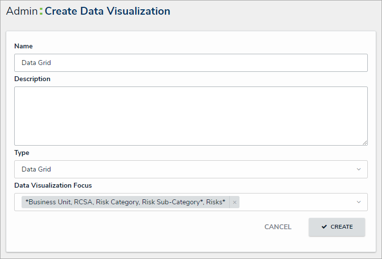 The Create Data Visualization page.
 - Click Create to display the Edit Data Grid page.
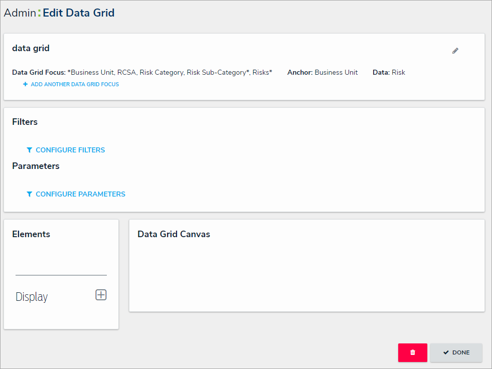 The Edit Data Grid page.
 - Optional: Click Add Another Data Grid Focus to include another report focus definition. Depending on the data path, selecting another focus will provide more data series options to choose from when adding a data grid.
- In the Elements section, click the
 icon beside Display.
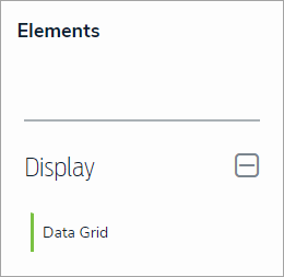 The Elements section.
 - Drag and drop Data Grid from the Elements section to the Data Grid Canvas.
- Select a data series from the Select a data series dropdown menu, then click Done. The data definition selected here will determine the object data you can display in the grid.
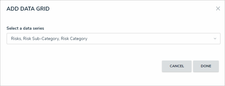 Selecting a data series in the Add Data Grid window.
 - Choose the data types you'd like to display in the grid from the Data Type tab. Selecting LIBRARY DATA will include object type data, while selecting an Assessment Type will include the assessment name and workflow state. By default, all data types are selected. To make individual selections, deselect the Select All checkbox, then click the data type(s) you wish to include. Clicking a selected data type will deselect it.
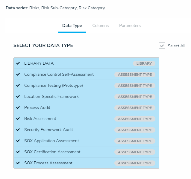 The Data Type tab.
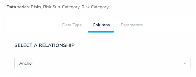
 - Click the Columns tab.
- Choose either the anchor or an object type in the data path from the Select a Relationship dropdown menu. The options in this dropdown menu will vary depending on the data series selected in the previous steps.
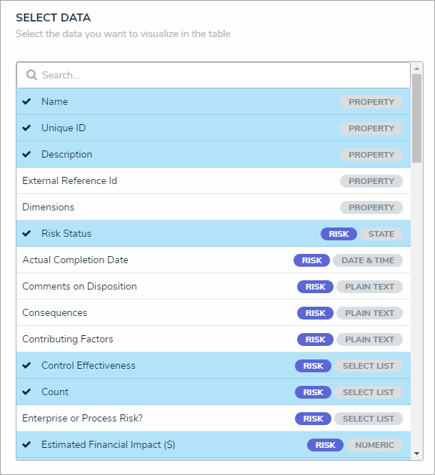
 Selecting which object types' data will appear in the grid.
 - Select the properties, workflow states, fields, formulas, relationships, and/or roles you want to display in the grid as columns from the Select Data section. Use the Search field to search for a particular data type, if needed. Clicking a selected data type will deselect it and remove it from the grid.
 The Select Data section.
- Continue selecting object types from the Select a Relationship dropdown menu to include more data by repeating steps 14 and 15 above.
- Optional: To allow users to open an object in a palette while viewing the grid:
- Select the Object can be accessed in the palette from data grid checkbox in the Define Custom Forms section. Selecting this checkbox enables an icon that appears when end-users hover their cursor over the Name column in the grid. Clicking the icon displays the object in a palette.
- Select a form from the dropdown menu to choose which form is displayed when the user clicks the palette icon. This dropdown will be hidden unless the checkbox from the step above is selected.
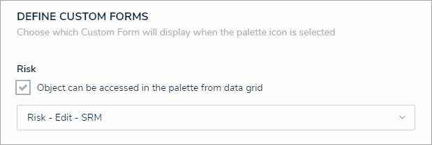 The Define Custom Forms section.
Users will not be able to view objects in a palette if the Name property isn't displayed in the data grid. See step 15 above to ensure this property is selected.
- Optional: In the Sort Columns section, click the
 icon beside any data types to mark their columns as read-only and prevent users from editing their cells in the grid. To mark all columns as read-only, select the Mark all columns as read-only checkbox at the bottom of the section. To once again enable editing, click the
 icon beside individual columns or deselect the checkbox.
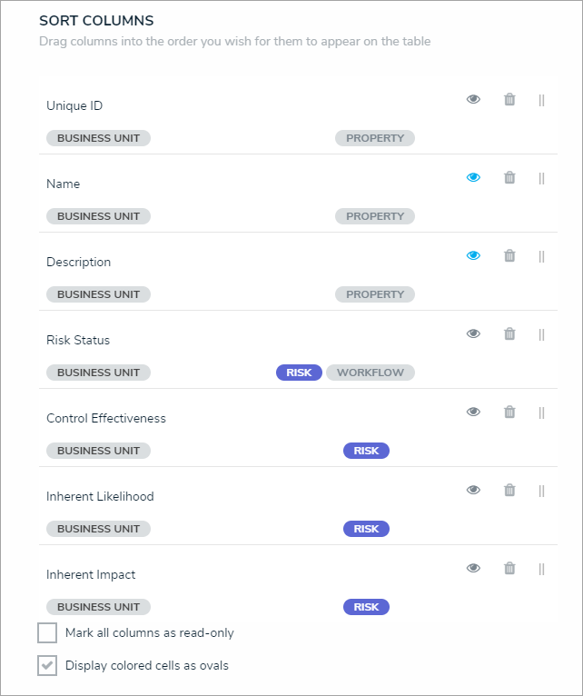 Th Sort Columns section.
If a user accessing the grid does not have the required workflow permissions to edit an object, the data will appear to that user as read-only, even if all data types are left editable in the settings. - Optional: Click and drag the
icon next to the data types to rearrange the order of the columns in the grid.
- Optional: If needed, click the
icon next to the data type to delete it from the grid.
- Optional: Select the Display colored cells as ovals checkbox to show formula or select list cells text with colored circles. When this option is not selected, cells are displayed with text and a full background color, if any. End-users can enable or disable this option when viewing the data grid.
- Scroll to the top of the Edit Data Grid palette, then click the Parameters tab.
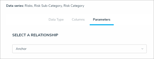 The Parameters tab.
 - Choose a relationship from the Select a Relationship dropdown menu. The relationship selected here will determine which parameters (filters) you can apply to the grid to refine the data that’s displayed. If needed, you can select a relationship that differs from the relationship selected in the Columns tab.

You can add parameters from an object type in the data series even if that object type isn't configured to display any data in the grid. - Below Define Parameters, select one or more parameters to filter the data displayed in the grid. Parameter options include:
- Workflow states;
- Select list options;
- Formula ranges (e.g. High, Medium, Low);
- By Current User. When one or more roles are selected in this parameter, only users within those roles can view the data in the grid. This feature is useful to create customized data grids for specific users. The available roles are determined by the object types in the table's data series; or
- By Date & Time Field or Created On/Modified On properties. Selecting a range in the By [Date Field] dropdown menu will filter the data relative to the value selected in the Date & Time field on the objects. Selecting a range in the By Created On ([Object Type Name]) or By Modified On ([Object Type Name]) dropdown menus will filter the data relative to the date the objects were created or modified. All date-related options filter data in UTC time. It's recommended a date parameter is used to refine large data sets for improved report performance. Options include:
- Today: Show data from today's date only.
- Last [X] Days: Show data within the last 30, 60, 90, or 180 days, relative to today's date.
- Custom: Shows data within the dates selected in the From and To fields. The table will include objects up to the end of that date.
- Repeat steps 23 and 24 above to add more parameters from additional object types.
- To remove a select list, formula, or role parameter, click the x icon beside parameter. To delete a date parameter, click the field, then press the Backspace or Delete key on your keyboard.
- Click Done to close the Edit Data Grid palette. If additional grids are required, a new report must be created by following the steps above.
 icon in the top bar > Data Visualizations in the Views section.

 icon beside Display.


 icon beside any data types to mark their columns as read-only and prevent users from editing their cells in the grid. To mark all columns as read-only, select the Mark all columns as read-only checkbox at the bottom of the section. To once again enable editing, click the
 icon beside individual columns or deselect the checkbox.
 icon next to the data types to rearrange the order of the columns in the grid.
 icon next to the data type to delete it from the grid.
Once a grid is successfully created and configured, it must be added to a view in an activity. See the Create a Data Grid View article for more information.