Our new Dashboard feature is available upon request for the initial launch phase. Please contact your Customer Success Manager to schedule implementation with our Services team.
Overview
Resolver’s Dashboard Builder allows Administrators to build custom Dashboards using the Dashboard Data Sets published within their Org.
Map Chart Types:
- Dot Maps: A Dot Map displays the geolocation of each record in the dataset as a dot on a map.
- Bubble Maps: A Bubble Map displays aggregated values in precise locations, with each bubble area proportional to the value represented (the higher the value, the bigger the bubble).
- Choropleth Maps: A Choropleth Map is a heatmap suitable for visualizing geographical divides of areas or regions, shaded according to the aggregated values. The darker, more intense colors are associated with larger data values.
 Warning:
All changes or edits made to a Chart are globally applied across all instances of the Chart unless you duplicate the Chart and apply changes or edits to the duplicated Chart.
User Account Requirements
The user account you use to log into Resolver must have Administrator permission to use the Dashboard Data Set Builder.
Related Information/Setup
To create a new Dashboard Data Set, please follow the link below:
Please refer to the Adding Geolocation Data to a Data Set article for more information on how to add Geolocation data to a Data Set.
After creating a Dashboard Data Set, the user must publish it before it can be used with the Dashboard Data Set Builder. Please follow the link below for more information on Publishing a Dashboard Data Set.
To add styles to your Chart, please follow the link below:
Please see the corresponding articles below for Information on Adding a Chart Type not covered by these instructions.
- Adding a Multi-Series Chart to a Dashboard
- Adding a Combo Chart to a Dashboard
- Adding a Table to a Dashboard
- Adding a Crosstab to a Dashboard
- Adding a Heatmap to a Dashboard
- Adding a Map to a Dashboard
- Adding a Box and Whiskers Chart to a Dashboard
Navigation
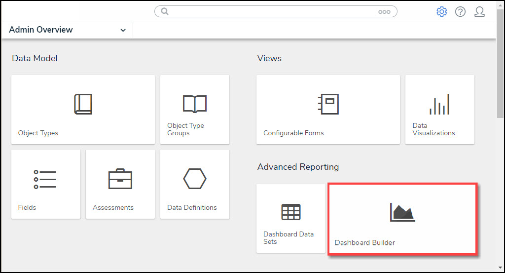
- From the Home screen, click on the System icon.
![]()
System Icon
- From the Admin Overview screen, click on the Dashboard Builder tile under the Advanced Reporting section.
Dashboard Data Sets Tile
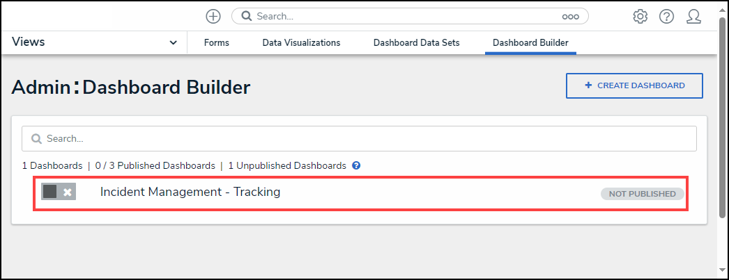
- From the Dashboard Builder screen, click on a Dashboard Name.
Dashboard Name
Adding a Map Chart to a Dashboard
For illustration purposes, we are will use the Dot Map Chart Type in the instructions below. However, you can also apply these instructions to Bubble Maps and Choropleth Map Chart Types.
Before using the Dashboards feature, at least one Dashboard Data Set needs to be created and published. Geolocation data must be added to a Data Set to create a Map Chart using the Dashboard Builder.
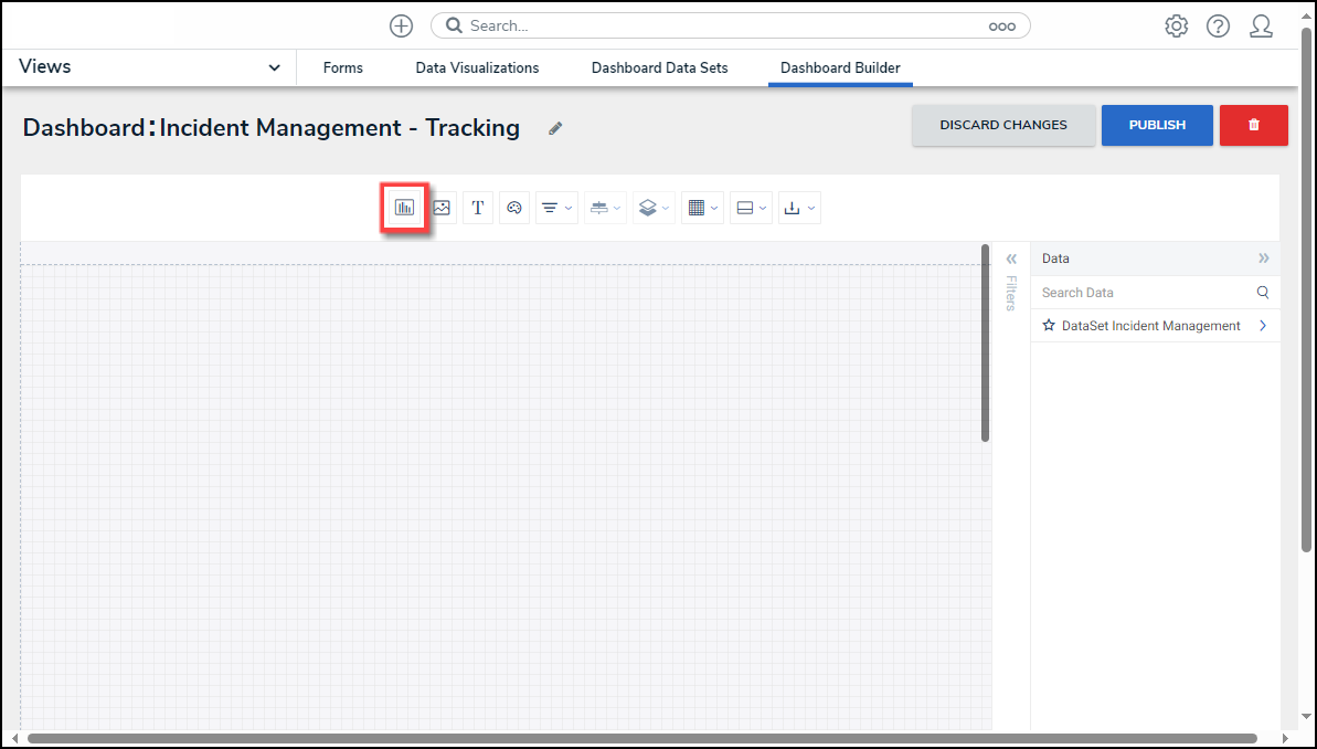
- From the Canvas Layout screen, click the Create Chart button.
Create Chart Button
- From the Chart screen, click on a Dashboard Data Set from the Data Panel.
Note:
Only published Dashboard Data Sets will appear on the Data Panel.

Dashboard Data Set
- Click in the Chart Header (Untitled Chart) field and enter a Chart Name. The first 36 characters will show in the Chart Header.

Chart Header and Description
- Click in the Add Description field and enter a Chart Description. The Chart Description will appear on the Data Panel under the Chart section and pop up when hovering your cursor over a Chart Name.
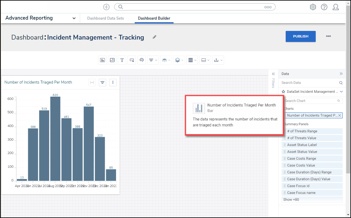
Chart Description
- Select the Dot Map tile from the Charts panel.

Dot Map Tile
- Dashboard Data Set Categories and Values will appear under the Dashboard Data Set Name on the Data Panel.
- Categories (Blue): Categories are text and data columns used to group data (e.g., Sales Region, Department Name, Order Dates, etc.).
- Values (Green): Values are numeric columns used to calculate data. Values can also be aggregated (e.g., Average Price Per Product, Total Sales Revenue, etc.).
- Categories and Values have a Data Type icon next to the Dashboard Data Set Name. Data Type icons indicate the Category and Value Data Type:
| |
| |
|
- Drag and drop the Geolocation Category from the Data Panel onto the Geolocation section at the bottom of the Chart or within the Geolocation field.

Drag and Drop a Category
- The Geolocation Category data will populate the Chart.

Category Data
- Click the Save Chart button to save your changes.
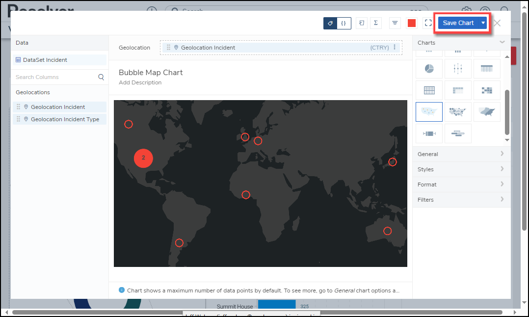
Save Chart Button