Our new Dashboard feature is available upon request for the initial launch phase. Please contact your Customer Success Manager if you'd like to schedule implementation with our Services team.
Overview
The Chart screen Elements article displays the location and provides a basic description of the elements that appear on the Charts screen.
 Warning:
All changes or edits made to a Chart are globally applied across all instances of that Chart. Create a Duplicate Chart to apply changes or edits that will not affect the original Chart.
User Account Requirements
The user account you use to log into Resolver must have Administrator permission to use the Dashboard Builder.
Related Information/Setup
To create a new Dashboard Data Set, please follow the link below:
After creating a Dashboard Data Set, the user must publish it before it can be used with the Dashboard Data Set Builder. Please follow the link below for more information on Publishing a Dashboard Data Set.
Please see the following articles to configure a Chart:
- Applying Styles to a Chart
- Applying General Configurations to a Chart
- Sorting Chart Data
- Applying Layers to a Chart
- Formatting a Chart
- Applying Filters to a Chart
- Creating a Bucket
- Creating a Formula
- Setting a Chart Theme
Navigation
- From the Home screen, click on the System icon.
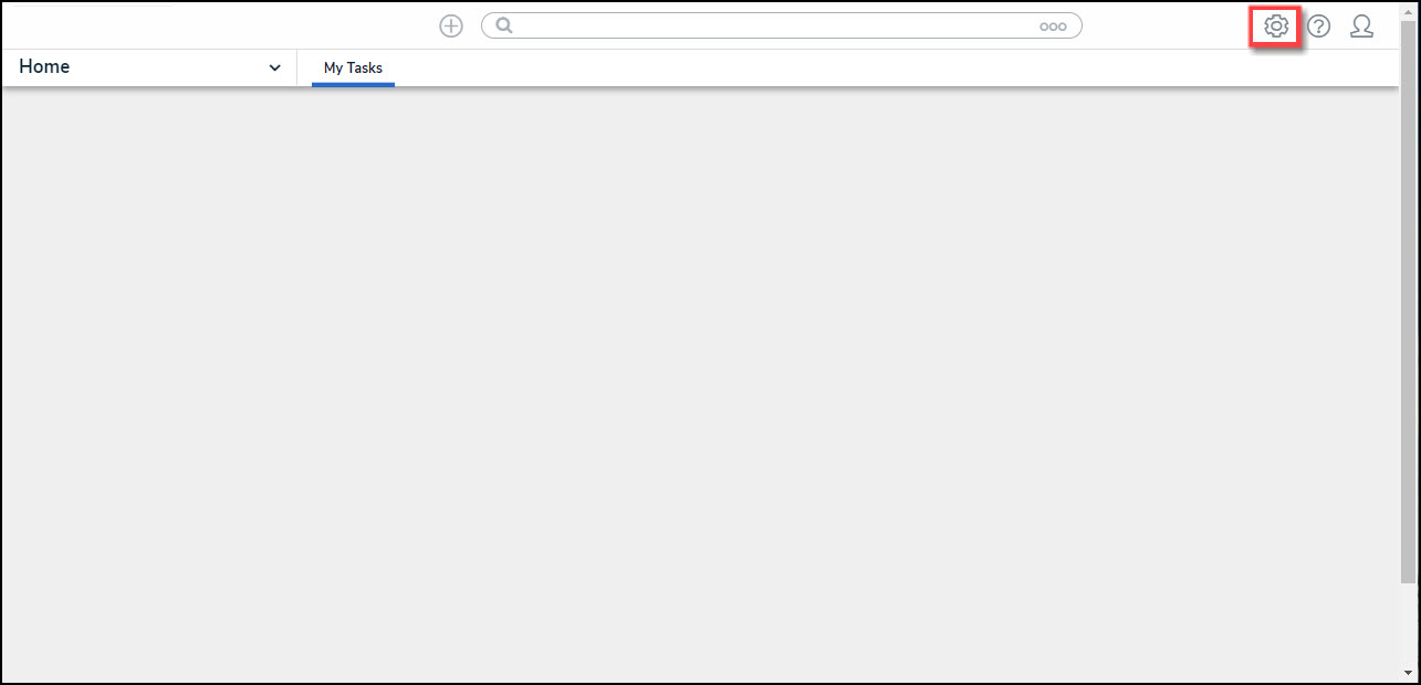
System Icon
- From the Admin Overview screen, click on the Dashboard Builder tile under the Advanced Reporting section.
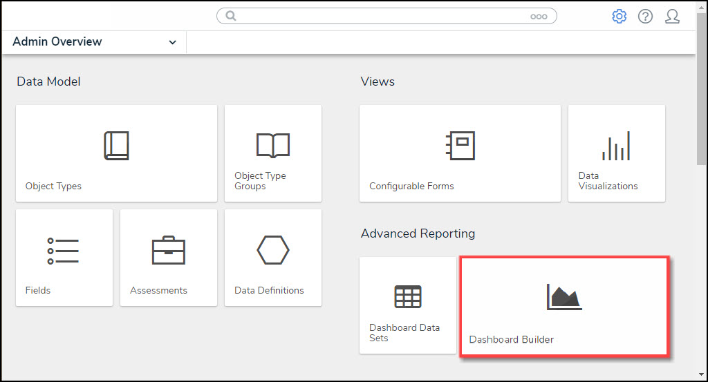
Dashboard Data Sets Tile
- From the Dashboard Builder screen, click on a Dashboard Name.
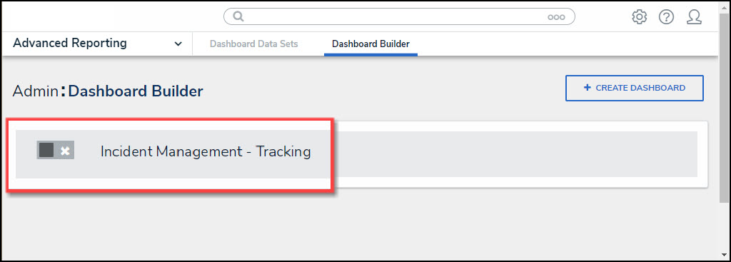
Dashboard Name
- From the Dashboard screen, to access the Chart screen, click on the Add Chart button.

Add Chart Button
- Or click on the More Options icon on an existing Chart View.
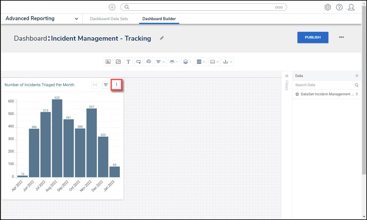
More Options Icon
- Select the Edit option from the More Options dropdown menu.

Edit Option
Screen Elements
- From the Chart screen, see the highlighted screen elements in the image below.

Chart Screen Elements Overview
- The screen elements that appear on the Chart screen are listed below:
Screen Element | Description | Additional Functions | |
|---|---|---|---|
| 1 | Data Panel | Data fields from the selected dataset are listed in this panel and can be dragged and dropped in various areas on the Canvas. The data fields are divided into Categories and Values. A Data Type icon appears next to the Name, representing the data type. | Categories: Categories are text and data columns used to group data (e.g., Sales Region, Department Name, Order Dates, etc.). |
| Values: Values are numeric columns used to calculate data. Values can also be aggregated (e.g., Average Price Per Product, Total Sales Revenue, etc.). | |||
| 2 | Column Shelf | Drag and drop Categories and Values into the corresponding fields on the Column Shelf to analyze the data. The number of fields on the Column Shelf and their data types depend on the Chart Type. | Category: Categories are text and data columns used to group data (e.g., Sales Region, Department Name, Order Dates, etc.). |
| Value: Values are numeric columns used to calculate data. Values can also be aggregated (e.g., Average Price Per Product, Total Sales Revenue, etc.). | |||
| 3 | Toolbar | The Toolbar on the Chart screen allows quick user access to add Buckets, Formulas and Filters, change Chart Color, save your work, etc. |  |
 Show Internationalization Labels: The Show Internationalization Labels button will display Chart labels using translations from the Internationalization spreadsheet. | |||
 Buckets: The Buckets button groups multiple data points into a single item, called a bucket, to make analysis easier. | |||
 Formulas: The Formulas button uses segment data to convert field data type (e.g., converting a string to a date), aggregate data, filter results, or calculate ratios. | |||
 Filters: The Filters button applies internal Filters to the Chart data. These Filters are part of the chart and will be retained in all instances of the chart across the entire application. | |||
 Chart Color: The Chart Color button changes the Main Color that appears on Bar and Line Charts by selecting a new color from the Color Picker. | |||
 Fit to Panel: The Fit to Panel button resizes the Chart to the size of the Chart Panel. | |||
 Enter Full Screen Mode: The Enter Full Screen Mode button resizes the Chart to fit the screen size. | |||
 Save Chart: The Save Chart button saves the Chart in its current state and returns to the Dashboard screen. If you go back into an existing Chart to edit it, you will see a new option under the Save Chart dropdown menu, Save as New. This option will allow you to save the Chart as a new Chart and will not override the original Chart. | |||
 Close: The Close button closes the Chart screen without saving changes and returns to the Dashboard screen. | |||
| 4 | Configuration Panel | The Configuration Panel, consists of two major sections, the Charts panel, where you can choose the type of chart you’ll be using, and the Chart Configuration panel, where you can apply different settings to configure your chart. | Charts: The Charts panel allows users to select a different Chart Type. A bar chart will be selected by default. |
| General: The General panel allows users to configure the Charts data. The options available vary depending on the Chart Type. | |||
| Styles: The Styles panel allows users to control visual aspects of a chart (e.g., color, axis labels, etc.). | |||
| Sorting: The Sorting panel allows users to apply sorting options to the Chart's data. | |||
| Layers: The Layers panel sets up trends and reference lines over your charts to reveal trends and help predict future trends. | |||
| Format: The Format panel allows users to apply Conditional Formatting (enables you to apply a style to the chart when the data meets certain criteria )or Small Multiples (produces one chart per distinct value of a selected column ) to a chart. | |||
| Filters: The Filters panel allows users to create and apply Internal Filters to the Chart's data. | |||
| 5 | Canvas | The Canvas is the main Dashboard area where charts will appear. The Canvas size is 1920px. |