Standard configurable forms allow information to be shared between organizations and users. To help ensure data is collected as seamlessly as possible, there are a number of recommendations and best practices administrators should consider when designing a form.
Fields
Labels
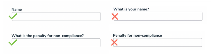
Concise, single-word labels are generally recommended for simple fields. When asking the user to input data to answer a question, that question should be as straightforward and unambiguous as possible. If the question requires some degree of complexity, think about how you would phrase the question if you were speaking to someone face-to-face.
Labels can be edited on existing fields from the Editing Field page.
Case
Avoid using title case when creating field labels for questions or phrases. Though title case may look more official, sentence case is easier to process and therefore faster to read. 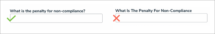
Size
Field sizes should indicate how much data is required in the field. For example, if you're adding the Name field on a form, a single line plain text field is more appropriate than a multiple line or rich text field. You can also configure the size of the field on a form by adjusting the form sections.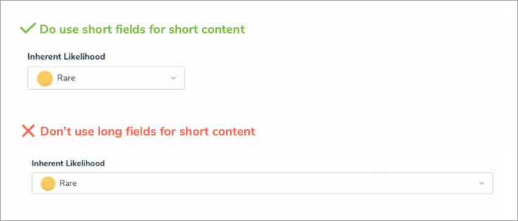
Layout
Aim to create your forms with only one column. When a form has multiple columns, it forces the user to scan the content in a Z pattern, making it harder and more time-consuming for the user to process and complete.
Help Text
Help text should be used sparingly, but there are some instances when it's useful or even essential. For example:
- The forms ask for unfamiliar data, such as information the user may not know off-hand or needs to research.
- The forms ask for sensitive data, such as a date of birth, and an explanation as to why this data is being collected.
- The user needs a guarantee that sensitive data, such as credit card information, is safe and secure.
That said, help text shouldn't be used to compensate for poorly designed forms. In fact, eye-tracking research shows that many people simply ignore excessive help text and go directly to the first input field anyway. Help text can be added to a form using the Free Form Text element.

Buttons
The text displayed on form buttons (state triggers) should inform the user of the action that will take place when the button is clicked (e.g., "Send to Risk Owner"). Primary action buttons should also be a distinct color to encourage the user to click that button under ideal conditions. The text and color of the button can be configured via the object type's workflow settings.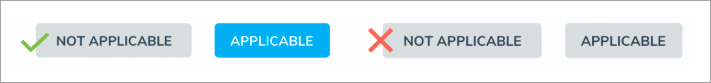
Buttons should also be displayed on forms in a size relative to the display text within the button. You can also configure the size of the button on a form by adjusting the form sections.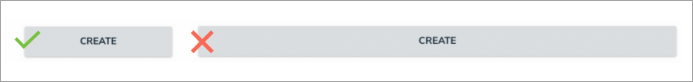
Palette Forms
When designing forms to be viewed in a palette, it's best practice to:
- Configure all sections on the form to display at 100% width.
- Place each form element on its own line, with the exception of two select lists, which can be be placed side-by-side, provided they don't contain a lot of content (i.e., long names or several options).
- Use palette forms primarily to share reference information. If a user needs to complete a lot of work, opt instead for a full-screen form.